Lesson 5. Classify a Raster in R.
Learning Objectives
After completing this tutorial, you will be able to:
- Reclassify a raster dataset in
Rusing a set of defined values. - Describe the difference between using breaks to plot a raster compared to reclassifying a raster object.
What You Need
You need R and RStudio to complete this tutorial. Also you should have an earth-analytics directory set up on your computer with a /data directory with it.
R Libraries to Install:
- raster:
install.packages("raster") - rgdal:
install.packages("rgdal")
If you have not already downloaded the week 3 data, please do so now. Download Week 3 Data (~250 MB)
Reclassification vs. Breaks
In this lesson, you will learn how to reclassify a raster dataset in R. Previously, you plotted a raster value using break points - that is to say, you colored particular ranges of raster pixels using a defined set of values that you call breaks. In this lesson, you will learn how to reclassify a raster. When you reclassify a raster you create a new raster object / file that can be exported and shared with colleagues and / or opened in other tools such as QGIS.

Load Libraries
# load the raster and rgdal libraries
library(raster)
library(rgdal)
Raster Classification Steps
You can break your raster processing workflow into several steps as follows:
- Data import / cleanup: Load and “clean” the data. This may include cropping, dealing with
NAvalues, etc. - Data exploration: Understand the range and distribution of values in your data. This may involve plotting histograms scatter plots, etc.
- More data processing & analysis: This may include the final data processing steps that you determined based upon the data exploration phase.
- Final data analysis: The final steps of your analysis - often performed using information gathered in the early data processing / exploration stages of your workflow.
- Presentation: Refining your results into a final plot or set of plots that are cleaned up, labeled, etc.
Please note - working with data is not a linear process. There are no defined steps. As you work with data more, you will develop your own workflow and approach.
To get started, let’s first open up your raster. In this case you are using the lidar canopy height model (CHM) that you calculated in the previous lesson.
# open canopy height model
lidar_chm <- raster("data/week-03/BLDR_LeeHill/outputs/lidar_chm.tif")
What Classification Values to Use?
You want to classify your raster into 3 classes:
- Short
- Medium
- Tall
However, what value represents a tall vs a short tree? You need to better understand your data before assigning classification values to it. Let’s begin by looking at the min and max values in your CHM.
summary(lidar_chm)
##      Length       Class        Mode
##     8000000 RasterLayer          S4
Looking at the summary above, it appears as if you have a range of values from 0 to 26.9300537.
Let’s explore the data further by looking at a histogram. A histogram quantifies the distribution of values found in your data.
# plot histogram of data
hist(lidar_chm,
     main = "Distribution of raster cell values in the DTM difference data",
     xlab = "Height (m)", ylab = "Number of Pixels",
     col = "springgreen")
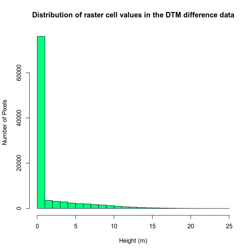
You can further explore your histogram by constraining the x axis limits using the lims argument. The lims argument visually zooms in on the data in the plot. It does not modify the data!
# zoom in on x and y axis
hist(lidar_chm,
     xlim = c(2, 25),
     ylim = c(0, 4000),
     main = "Histogram of canopy height model differences \nZoomed in to -2 to 2 on the x axis",
     col = "springgreen")
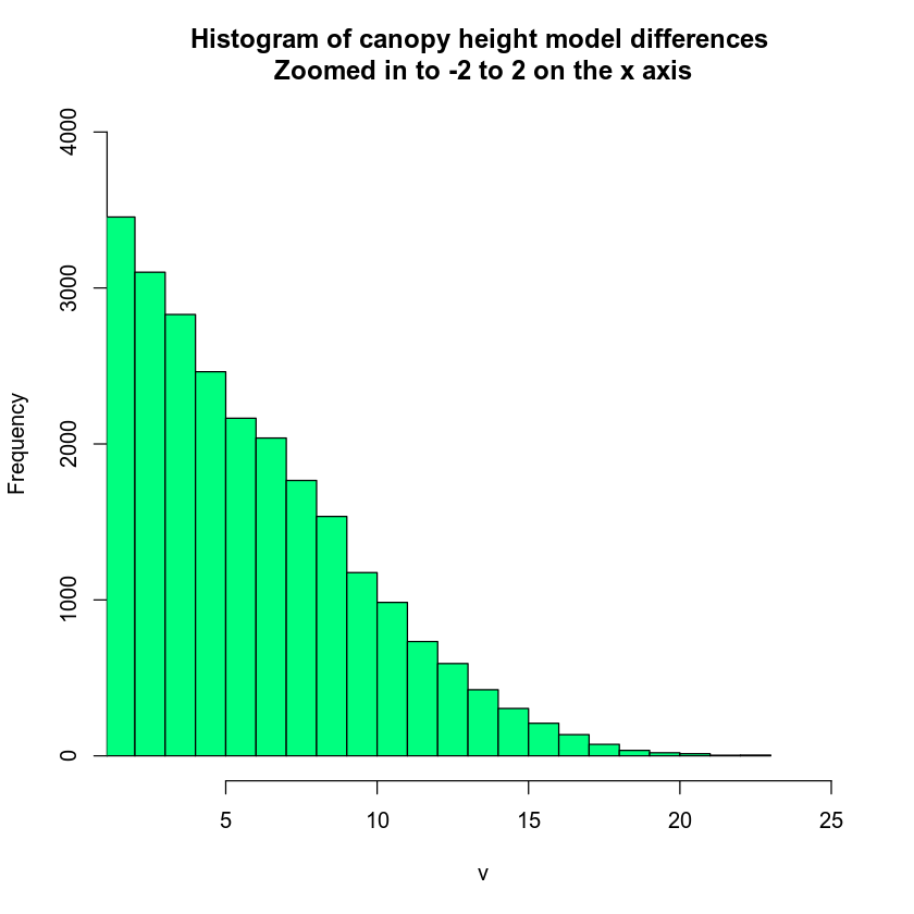
You can look at the values that R used to draw your histogram too. To do this, you assign your hist() function to a new variable. Then you look at the variable contents. This shows you the breaks used to bin your histogram data.
# see how R is breaking up the data
histinfo <- hist(lidar_chm)
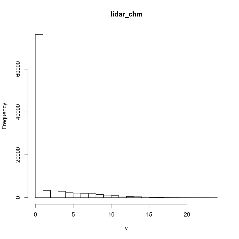
Each bin represents a bar on your histogram plot. Each bar represents the frequency or number of pixels that have a value within that bin. For instance, there is a break between 0 and 1 in the histogram results above. And there are 76,057 pixels in the counts element that fall into that bin.
histinfo$counts
##  [1] 76161  3395  3115  2943  2337  2105  1984  1859  1476  1164   956   690
## [13]   583   445   296   182   137    71    54    25    12     6     3     1
histinfo$breaks
##  [1]  0  1  2  3  4  5  6  7  8  9 10 11 12 13 14 15 16 17 18 19 20 21 22 23 24
If you want to customize your histogram further, you can customize the number of breaks that R uses to create it.
# zoom in on x and y axis
hist(lidar_chm,
     xlim = c(2, 25),
     ylim = c(0, 1000),
     breaks = 100,
     main = "Histogram of canopy height model differences \nZoomed in to -2 to 2 on the x axis",
     col = "springgreen",
     xlab = "Pixel value")
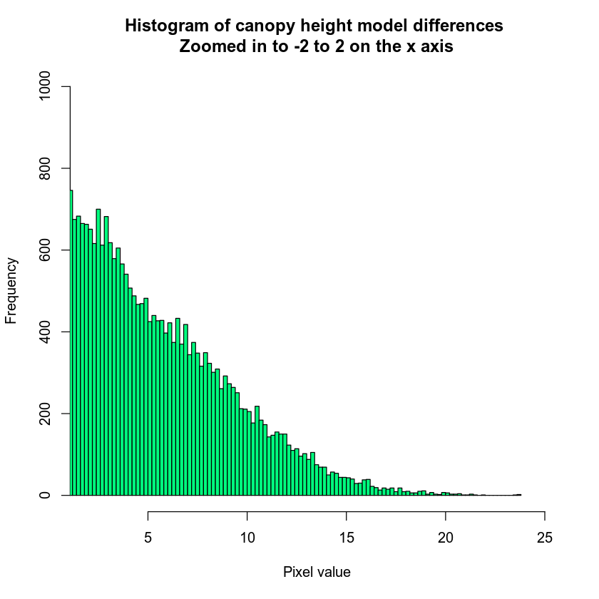
Notice that I’ve adjusted the x and y lims to zoom into the region of the histogram that I am interested in exploring.
Histogram with Custom Breaks
You can create custom breaks or bins in a histogram too. To do this, you pass the same breaks argument a vector of numbers that represent the range for each bin in your histogram.
By using custom breaks, you can explore how your data may look when you classify it.
# You may want to explore breaks in your histogram before plotting your data
hist(lidar_chm,
     breaks = c(0, 5, 10, 15, 20, 30),
     main = "Histogram with custom breaks",
     xlab = "Height (m)" , ylab = "Number of Pixels",
     col = "springgreen")
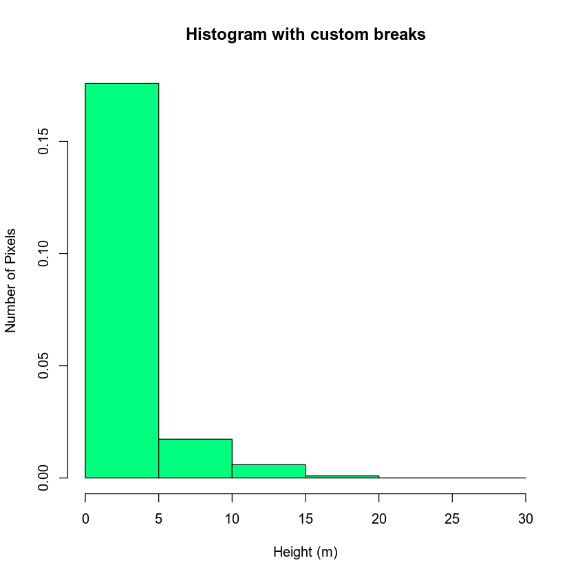
You may want to play with the distribution of breaks. Below it appears as if there are many values close to 0. In the case of this lidar instrument you know that values between 0 and 2 meters are not reliable (you know this if you read the documentation about the NEON sensor and how these data were processed). Let’s create a bin between 0-2.
You know you want to create bins for short, medium and tall trees so let’s experiment with those bins also.
Below I use the following breaks:
- 0 - 2 = no trees
- 2 - 4 = short trees
- 4 - 7 = medium trees
>7 = tall trees
# You may want to explore breaks in your histogram before plotting your data
hist(lidar_chm,
     breaks = c(0, 2, 4, 7, 30),
     main = "Histogram with custom breaks",
     xlab = "Height (m)" , ylab = "Number of Pixels",
     col = "springgreen")
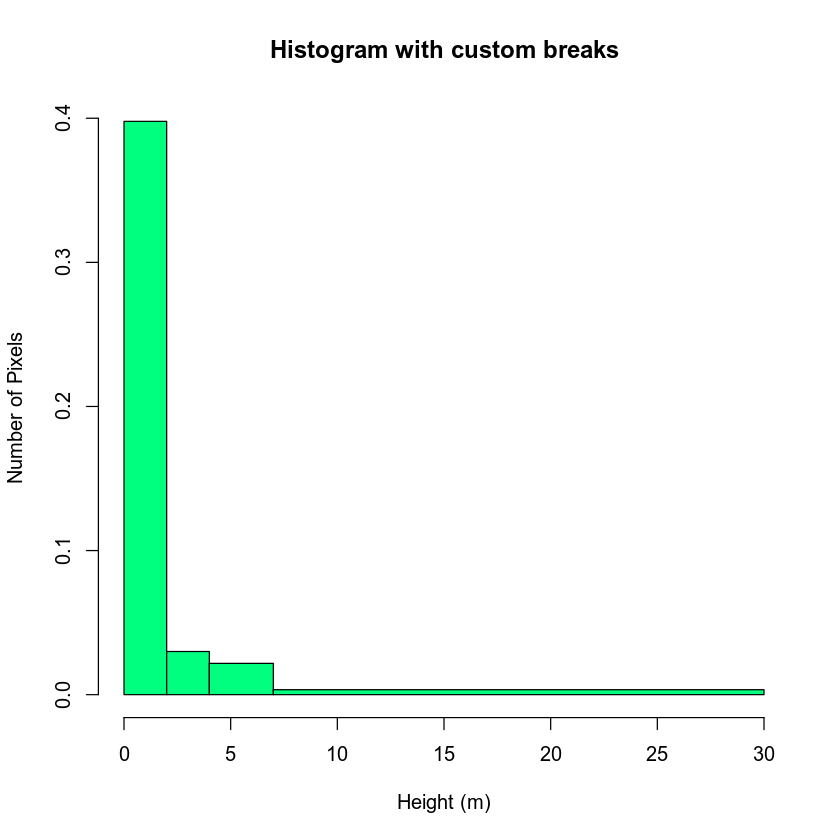
You may want to play around with the classes further. Or you may have a scientific reason to select particular classes. Regardless, let’s use the classes above to reclassify your CHM raster.
Map Raster Values to New Values
To reclassify your raster, first you need to create a reclassification matrix. This matrix MAPS a range of values to a new defined value. Let’s create a classified canopy height model where you designate short, medium and tall trees.
The newly defined values will be as follows:
- No trees: (0m - 2m tall) = NA
- Short trees: (2m - 4m tall) = 1
- Medium trees: (4m - 7m tall) = 2
- Tall trees: (> 7m tall) = 3
Notice in the list above that you set cells with a value between 0 and 2 meters to NA or no data value. This means you are assuming that there are no trees in those locations!
Notice in the matrix below that you use Inf to represent the largest or max value found in the raster. So your assignment is as follows:
- 0 - 2 meters -> NA
- 2 - 4 meters -> 1 (short trees)
- 4-7 meters -> 2 (medium trees)
>7 or 7 - Inf -> 3 (tall trees)
Let’s create the matrix!
# create classification matrix
reclass_df <- c(0, 2, NA,
              2, 4, 1,
             4, 7, 2,
             7, Inf, 3)
reclass_df
##  [1]   0   2  NA   2   4   1   4   7   2   7 Inf   3
Next, you reshape your list of numbers below into a matrix with rows and columns. The matrix data format supports numeric data and can be one or more dimensions. Your matrix below is similar to a spreadsheet with rows and columns.
# reshape the object into a matrix with columns and rows
reclass_m <- matrix(reclass_df,
                ncol = 3,
                byrow = TRUE)
reclass_m
##      [,1] [,2] [,3]
## [1,]    0    2   NA
## [2,]    2    4    1
## [3,]    4    7    2
## [4,]    7  Inf    3
Reclassify Raster
Once you have created your classification matrix, you can reclassify your CHM raster using the reclassify() function.
# reclassify the raster using the reclass object - reclass_m
chm_classified <- reclassify(lidar_chm,
                     reclass_m)
You can view the distribution of pixels assigned to each class using the barplot(). Note that I am not using the histogram function in this case given you only have 3 classes!
# view reclassified data
barplot(chm_classified,
        main = "Number of pixels in each class")
![]()
If the raster classification output has values of 0, you can set those to NA using the syntax below. The left side of this syntax tells R to first select ALL pixels in the raster where the pixel value = 0. chm_classified[chm_classified == 0]. Notice the use of two equal signs == in this statement.
The right side of the code says “assign to NA” <- NA
# assign all pixels that equal 0 to NA or no data value
chm_classified[chm_classified == 0] <- NA
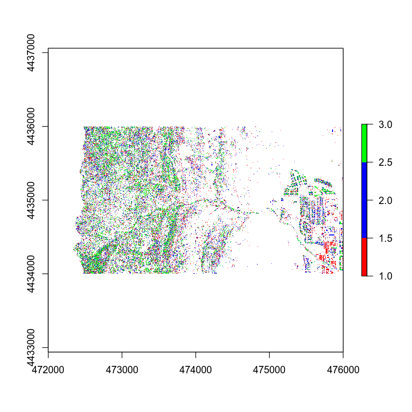
Then, finally you can plot your raster. Notice the colors that I selected are not ideal! You can pick better colors for your plot.
# plot reclassified data
plot(chm_classified,
     col = c("red", "blue", "green"))
Add Custom Legend
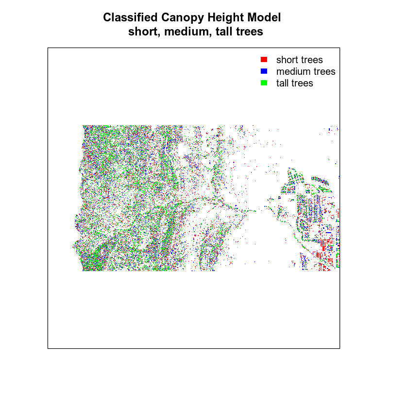
Your plot looks OK but the legend doesn’t represent the data well. The legend is continuous - with a range between 0 and 3. However you want to plot the data using discrete bins.
Let’s clean up your plot legend. Given you have discrete values you will create a CUSTOM legend with the 3 categories that you created in your classification matrix.
# plot reclassified data
plot(chm_classified,
     legend = FALSE,
     col = c("red", "blue", "green"), axes = FALSE,
     main = "Classified Canopy Height Model \n short, medium, tall trees")

legend("topright",
       legend = c("short trees", "medium trees", "tall trees"),
       fill = c("red", "blue", "green"),
       border = FALSE,
       bty = "n") # turn off legend border
Finally, let’s create a color object so you don’t have to type out the colors twice.
# create color object with nice new colors!
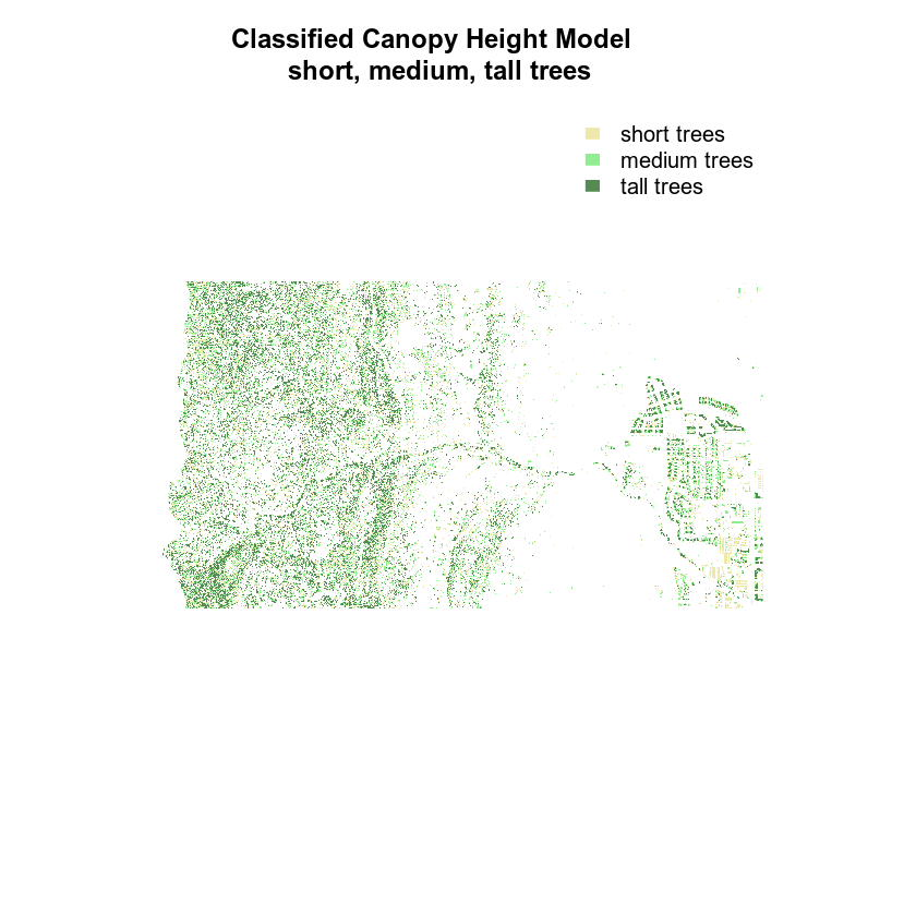
chm_colors <- c("palegoldenrod", "palegreen2", "palegreen4")

# plot reclassified data
plot(chm_classified,
     legend = FALSE,
     col = chm_colors,
     axes = FALSE,
     # remove the box around the plot
     box = FALSE,
     main = "Classified Canopy Height Model \n short, medium, tall trees")

legend("topright",
       legend = c("short trees", "medium trees", "tall trees"),
       fill = chm_colors,
       border = FALSE,
       bty = "n")

Finally, you may want to remove the box from your plot.
# create color object with nice new colors!
chm_colors <- c("palegoldenrod", "palegreen2", "palegreen4")

# plot reclassified data
plot(chm_classified,
     legend = FALSE,
     col = chm_colors,
     axes = FALSE,
     box = FALSE,
     main = "Classified Canopy Height Model \n short, medium, tall trees")

legend("topright",
       legend = c("short trees", "medium trees", "tall trees"),
       fill = chm_colors,
       border = FALSE,
       bty = "n")
Optional Challenge: Plot Change Over Time
- Create a classified raster map that shows positive and negative change in the canopy height model before and after the flood. To do this you will need to calculate the difference between two canopy height models.
- Create a classified raster map that shows positive and negative change in terrain extracted from the pre and post flood Digital Terrain Models before and after the flood.
For each plot, be sure to:
- Add a legend that clearly shows what each color in your classified raster represents.
- Use better colors than I used in my example above!
- Add a title to your plot.
You will include these plots in your final report due next week.
Check out this cheatsheet for more on colors in R.
Or type: grDevices::colors() into the r console for a nice list of colors!
Share on
Twitter Facebook Google+ LinkedIn
Leave a Comment