Lesson 2. Plot Histograms of Raster Values in R
Learning Objectives
After completing this tutorial, you will be able to:
- Open raster data in
R. - Create a histogram of raster values in
R. - Draw information on raster attributes from a histogram.
What You Need
You will need a computer with internet access to complete this lesson.
If you have not already downloaded the week 3 data, please do so now. Download Week 3 Data (~250 MB)
In the last lesson, you learned 3 key attributes of a raster dataset:
- Spatial resolution
- Spatial extent
- Coordinate reference systems
In this lesson, you will learn how to use histograms to better understand the distribution of your data.
Open Raster Data in R
To work with raster data in R, you can use the raster and rgdal packages. Remember you can use the raster() function to import the raster object into R.
# load libraries
library(raster)
library(rgdal)

# Make sure your working directory is set to  wherever your 'earth-analytics' dir is
# setwd("earth-analytics-dir-path-here")

# open raster data
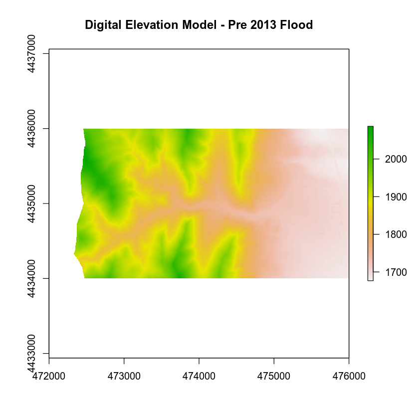
lidar_dem <- raster(x = "data/week-03/BLDR_LeeHill/pre-flood/lidar/pre_DTM.tif")

# plot raster data
plot(lidar_dem,
     main = "Digital Elevation Model - Pre 2013 Flood")
Raster Histograms - Distribution of Elevation Values
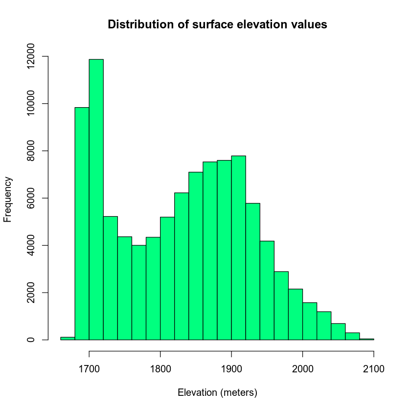
The histogram below represents the distribution of pixel elevation values in your data. This plot is useful to:
- Identify outlier data values.
- Assess the min and max values in your data.
- Explore the general distribution of elevation values in the data (i.e. is the area generally flat, hilly, high elevation or low elevation).
Notice that you are using the xlab and ylab arguments in your plot to label your plot axes.
# plot histogram
hist(lidar_dem,
     main = "Distribution of surface elevation values",
     xlab = "Elevation (meters)", ylab = "Frequency",
     col = "springgreen")
What Does a Histogram Tell Us?
A histogram shows us how the data are distributed. Each bin or bar in the plot represents the number or frequency of pixels that fall within the range specified by the bin.
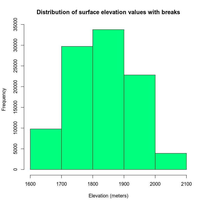
You can use the breaks = argument to specify fewer or more breaks in your histogram. Note that this argument does not result in the exact number of breaks that you may want in your histogram.
# plot histogram
hist(lidar_dem,
     breaks = 3,
     main = "Distribution of surface elevation values with breaks",
     xlab = "Elevation (meters)", ylab = "Frequency",
     col = "springgreen")
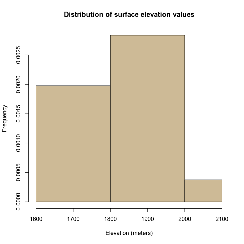
Alternatively, you can specify specific break points that you want R to use when it bins the data.
breaks = c(1600, 1800, 2000, 2100)
In this case, R will count the number of pixels that occur within each value range as follows:
bin 1: number of pixels with values between 1600-1800 bin 2: number of pixels with values between 1800-2000 bin 3: number of pixels with values between 2000-2100
# plot histogram
hist(lidar_dem,
     main = "Distribution of surface elevation values",
     breaks = c(1600, 1800, 2000, 2100),
     xlab = "Elevation (meters)", ylab = "Frequency",
     col = "wheat3")
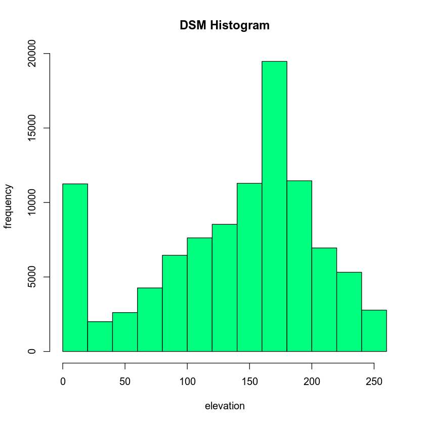
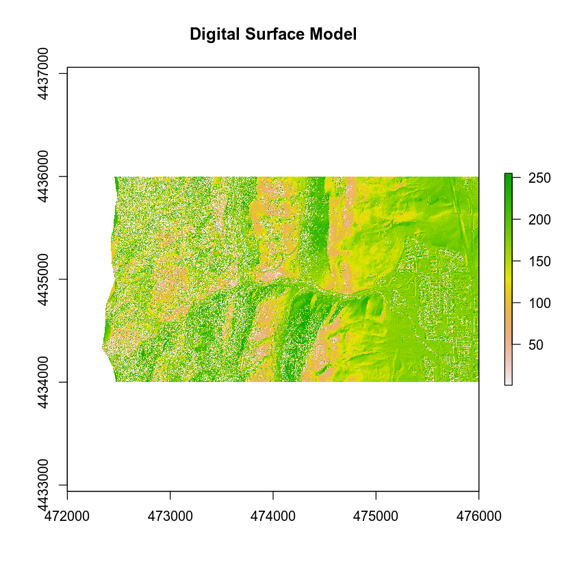
In-class Challenge - Import DSM
- Import the file:
data/week-03/BLDR_LeeHill/pre-flood/lidar/pre_DSM_hill.tif
Plot the data and a histogram of the data. What do the elevations in the DSM represent? Are they different from the DTM? Discuss this with your neighbor.
- What is the CRS and spatial resolution for this dataset? What units is the spatial resolution in?
Share on
Twitter Facebook Google+ LinkedIn