Lesson 1. GIS in R: Plot Spatial Data and Create Custom Legends in R
Create Maps and Custom Legends in R with ggplot and Base Plot - Earth analytics course module
Welcome to the first lesson in the Create Maps and Custom Legends in R with ggplot and Base Plot module. Learn how to create maps with custom colors and legends in both base R and with ggplot in R.Learning Objectives
After completing this tutorial, you will be able to:
- Add a custom legend to a map in
R. - Plot a vector dataset by attributes in
R.
What You Need
You will need a computer with internet access to complete this lesson and the data for week 4 of the course.
Plot Lines by Attribute Value
To plot vector data with the color of each objected determined by it’s associated attribute values, the attribute values must be class = factor. A factor is similar to a category
- you can group vector objects by a particular category value - for example you can group all lines of
TYPE=footpath. However, inR, a factor can also have a determined order.
By default, R will import spatial object attributes as factors.
Data Tip: If your data attribute values are not read in as factors, you can convert the categorical attribute values using as.factor().
# load libraries
library(raster)
library(rgdal)
options(stringsAsFactors = FALSE)
Next, import and explore the data.
# import roads
sjer_roads <- readOGR("data/week-04/california/madera-county-roads/tl_2013_06039_roads.shp")
## OGR data source with driver: ESRI Shapefile
## Source: "/root/earth-analytics/data/week-04/california/madera-county-roads/tl_2013_06039_roads.shp", layer: "tl_2013_06039_roads"
## with 9640 features
## It has 4 fields
# view the original class of the TYPE column
class(sjer_roads$RTTYP)
## [1] "character"
unique(sjer_roads$RTTYP)
## [1] "M" NA  "S" "C"
It looks like you have some missing values in your road types. You want to plot all road types even those that are NA. Let’s change the roads with an RTTYP attribute of NA to “unknown”.
Following, you can convert the road attribute to a factor.
# set all NA values to "unknown" so they still plot
sjer_roads$RTTYP[is.na(sjer_roads$RTTYP)] <- "Unknown"
unique(sjer_roads$RTTYP)
## [1] "M"       "Unknown" "S"       "C"

# view levels or categories - note that there are no categories yet in your data!
# the attributes are just read as a list of character elements.
levels(sjer_roads$RTTYP)
## NULL

# Convert the TYPE attribute into a factor
# Only do this IF the data do not import as a factor!
sjer_roads$RTTYP <- as.factor(sjer_roads$RTTYP)
class(sjer_roads$RTTYP)
## [1] "factor"
levels(sjer_roads$RTTYP)
## [1] "C"       "M"       "S"       "Unknown"

# how many features are in each category or level?
summary(sjer_roads$RTTYP)
##       C       M       S Unknown
##      10    4456      25    5149
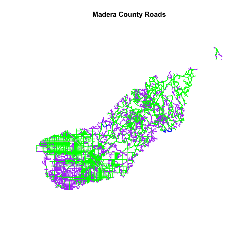
When you use plot(), you can specify the colors to use for each attribute using the col = element. To ensure that R renders each feature by it’s associated factor / attribute value, you need to create a vector or colors - one for each feature, according to its associated attribute value / factor value.
To create this vector you can use the following syntax:
c("colorOne", "colorTwo", "colorThree")[object$factor]
Note in the above example you have
- A vector of colors - one for each factor value (unique attribute value).
- The attribute itself (
[object$factor]) of classfactor.
Let’s give this a try.
# count the number of unique values or levels
length(levels(sjer_roads$RTTYP))
## [1] 4

# create a color palette of 4 colors - one for each factor level
road_palette <- c("blue", "green", "grey", "purple")
road_palette
## [1] "blue"   "green"  "grey"   "purple"
# create a vector of colors - one for each feature in your vector object
# according to its attribute value
all_road_colors <- c("blue", "green", "grey", "purple")[sjer_roads$RTTYP]
head(all_road_colors)
## [1] "green" "green" "green" "green" "green" "green"

# plot the lines data, apply a diff color to each factor level)
plot(sjer_roads,
     col = all_road_colors,
     lwd = 2,
     main = "Madera County Roads")
Adjust Line Width
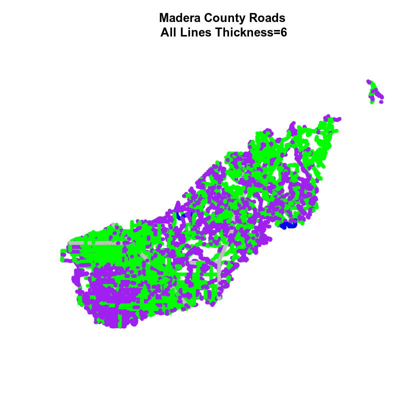
You can also adjust the width of your plot lines using lwd. You can set all lines to be thicker or thinner using lwd=.
# make all lines thicker
plot(sjer_roads,
     col = all_road_colors,
     main = "Madera County Roads\n All Lines Thickness=6",
     lwd = 6)
Adjust Line Width by Attribute
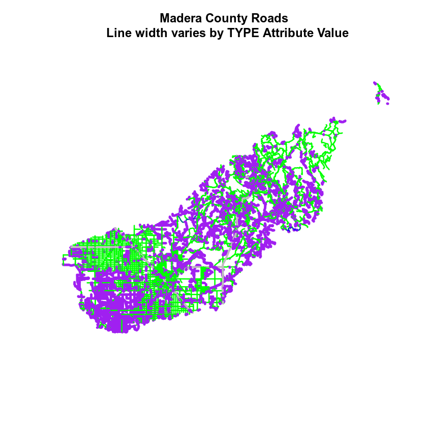
If you want a unique line width for each factor level or attribute category in your spatial object, you can use the same syntax that you used for colors, above.
lwd = c("widthOne", "widthTwo","widthThree")[object$factor]
Note that this requires the attribute to be of class factor. Let’s give it a try.
class(sjer_roads$RTTYP)
## [1] "factor"
levels(sjer_roads$RTTYP)
## [1] "C"       "M"       "S"       "Unknown"
# create vector of line widths
lineWidths <- (c(1, 2, 3, 4))[sjer_roads$RTTYP]
# adjust line width by level
# in this case, boardwalk (the first level) is the widest.
plot(sjer_roads,
     col = all_road_colors,
     main = "Madera County Roads \n Line width varies by TYPE Attribute Value",
     lwd = lineWidths)
Optional Challenge: Plot Line Width by Attribute
You can customize the width of each line, according to specific attribute value, too. To do this, you create a vector of line width values, and map that vector to the factor levels - using the same syntax that you used above for colors. HINT: lwd=(vector of line width thicknesses)[spatialObject$factorAttribute]
Create a plot of roads using the following line thicknesses:
- unknown lwd = 3
- M lwd = 1
- S lwd = 2
- C lwd = 1.5
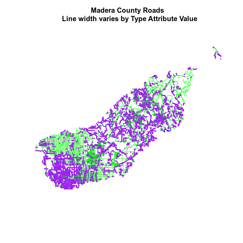
Data Tip: Given you have a factor with 4 levels, you can create an vector of numbers, each of which specifies the thickness of each feature in your SpatialLinesDataFrame by factor level (category): c(6,4,1,2)[sjer_roads$RTTYP]
Add Plot Legend
You can add a legend to your plot too. When you add a legend, you use the following elements to specify labels and colors:
- location: you can specify an x and Y location of the plot Or generally specify the location e.g. ‘bottomright’ keyword. You could also use
top,topright, etc. levels(objectName$attributeName): Label the legend elements using the categories oflevelsin an attribute (e.g., levels(sjer_roads$RTTYP) means use the levels C, S, footpath, etc).fill =: apply unique colors to the boxes in your legend.palette()is the default set of colors thatRapplies to all plots.
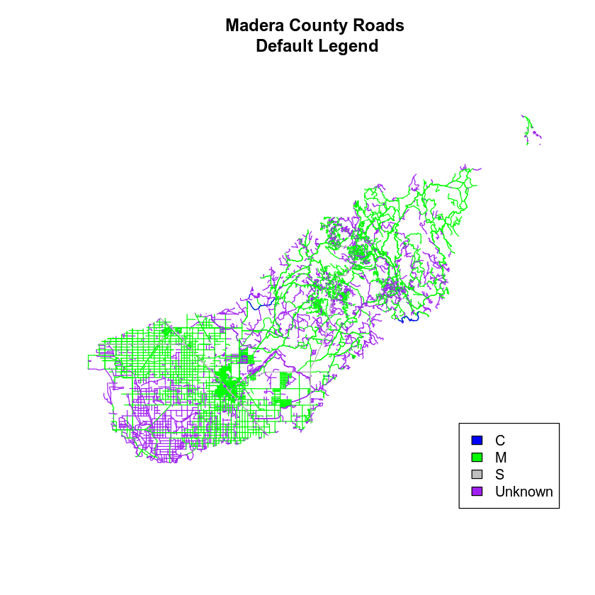
Let’s add a legend to your plot.
# add legend to plot
plot(sjer_roads,
     col = all_road_colors,
     main = "Madera County Roads\n Default Legend")

# you can use the color object that you created above to color the legend objects
road_palette
## [1] "blue"   "green"  "grey"   "purple"

# add a legend to your map
legend("bottomright",   # location of legend
      legend = levels(sjer_roads$RTTYP), # categories or elements to render in
			 # the legend
      fill = road_palette) # color palette to use to fill objects in legend.
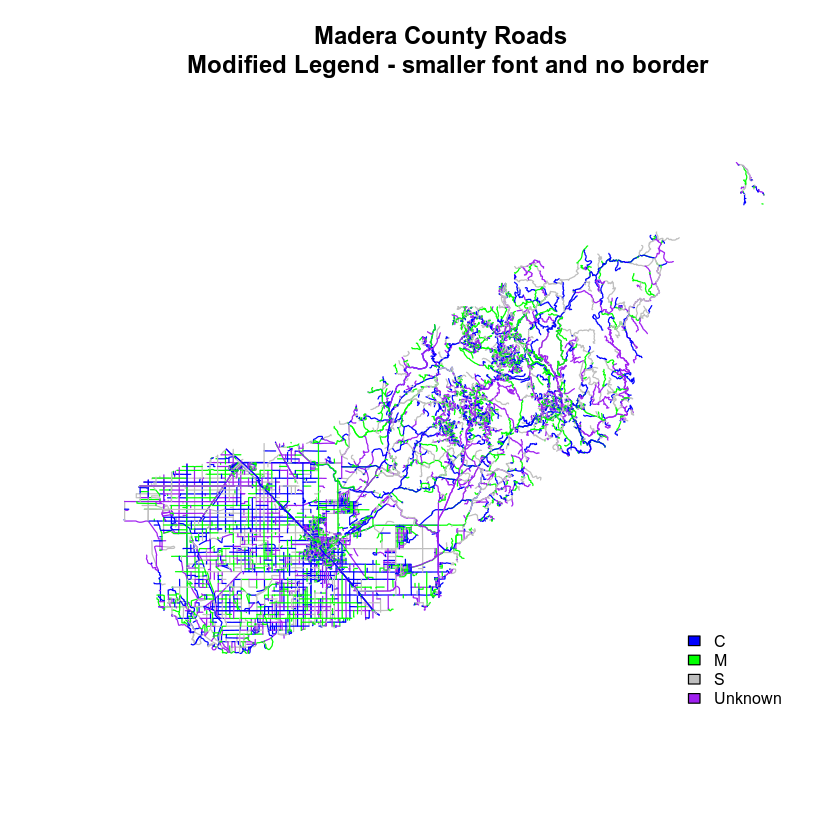
You can tweak the appearance of your legend too.
bty = "n": turn off the legend BORDERcex: change the font size
Let’s try it out.
# adjust legend
plot(sjer_roads,
     col = road_palette,
     main = "Madera County Roads \n Modified Legend - smaller font and no border")
# add a legend to your map
legend("bottomright",
       legend = levels(sjer_roads$RTTYP),
       fill = road_palette,
       bty = "n", # turn off the legend border
       cex = .8) # decrease the font / legend size
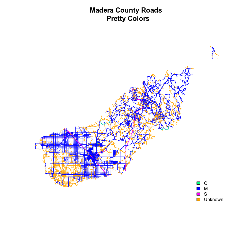
You can modify the colors used to plot your lines by creating a new color vector, directly in the plot code too rather than creating a separate object.
col = (newColors)[sjer_roads$RTTYP]
Let’s try it!
# manually set the colors for the plot!
newColors <- c("springgreen", "blue", "magenta", "orange")
newColors
## [1] "springgreen" "blue"        "magenta"     "orange"

# plot using new colors
plot(sjer_roads,
     col = (newColors)[sjer_roads$RTTYP],
     main = "Madera County Roads \n Pretty Colors")

# add a legend to your map
legend("bottomright",
       levels(sjer_roads$RTTYP),
       fill = newColors,
       bty = "n", cex = .8)
Data tip: You can modify the defaul R color palette using the palette method. For example palette(rainbow(6)) or palette(terrain.colors(6)). You can reset the palette colors using palette("default")!
Plot Lines by Attribute
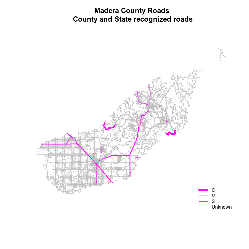
Create a plot that emphasizes only roads designated as C or S (County or State). To emphasize these types of roads, make the lines that are C or S, THICKER than the other lines. NOTE: this attribute information is located in the sjer_roads$RTTYP attribute.
Be sure to add a title and legend to your map! You might consider a color palette that has all County and State roads displayed in a bright color. All other lines can be grey.
# view levels
levels(sjer_roads$RTTYP)
## [1] "C"       "M"       "S"       "Unknown"
# make sure the attribute is of class "factor"
class(sjer_roads$RTTYP)
## [1] "factor"

# convert to factor if necessary
sjer_roads$RTTYP <- as.factor(sjer_roads$RTTYP)
levels(sjer_roads$RTTYP)
## [1] "C"       "M"       "S"       "Unknown"

# count factor levels
length(levels(sjer_roads$RTTYP))
## [1] 4
# set colors so only the allowed roads are magenta
# note there are 3 levels so you need 3 colors
challenge_colors <- c("magenta","grey","magenta","grey")
challenge_colors
## [1] "magenta" "grey"    "magenta" "grey"

# plot using new colors
plot(sjer_roads,
     col = (challenge_colors)[sjer_roads$RTTYP],
     lwd = c(4,1,1,1)[sjer_roads$RTTYP],
     main = "SJER Roads")

# add a legend to your map
legend("bottomright",
       levels(sjer_roads$RTTYP),
       fill = challenge_colors,
       bty = "n", # turn off border
       cex = .8) # adjust font size

Finall, let’s adjust the legend. You want the legend SYMBOLS to represent the actual symbology in the map - which contains lines, not polygons.
# plot using new colors
plot(sjer_roads,
     col = (challenge_colors)[sjer_roads$RTTYP],
     lwd = c(4,1,2,1)[sjer_roads$RTTYP], # color each line in the map by attribute
     main = "Madera County Roads\n County and State recognized roads")

# add a legend to your map
legend("bottomright",
       levels(sjer_roads$RTTYP),
       lty = c(1, 1, 1, 1), # tell are which objects to be drawn as a line in the legend.
       lwd = c(4, 1, 2, 1),  # set the WIDTH of each legend line
       col = challenge_colors, # set the color of each legend line
       bty = "n", # turn off border
       cex = .8) # adjust font size
Adding Points and Lines to a Legend
The last step in customizing a legend is adding different types of symbols to the plot. In the example above, you just added lines. But what if you wanted to add some POINTS too? You will do that next.
In the data below, you’ve create a custom legend where each symbol type and color is defined using a vector. You have 3 levels: grass, soil and trees. Thus you need to define 3 symbols and 3 colors for your legend and your plot.
pch = c(8,18,8)
plot_colors <- c("chartreuse4", "burlywood4", "darkgreen")
# import points layer
sjer_plots <- readOGR("data/week-04/california/SJER/vector_data/SJER_plot_centroids.shp")
sjer_plots$plot_type <- as.factor(sjer_plots$plot_type)
levels(sjer_plots$plot_type)
## [1] "grass" "soil"  "trees"
# grass, soil trees
plot_colors <- c("chartreuse4", "burlywood4", "darkgreen")

# plot using new colors
plot(sjer_plots,
     col = (plot_colors)[sjer_plots$plot_type],
     pch = 8,
     main = "Madera County Roads\n County and State recognized roads")


# add a legend to your map
legend("bottomright",
       legend = c(levels(sjer_plots$plot_type)),
       pch = c(8, 18, 8),  # set the WIDTH of each legend line
       col = plot_colors, # set the color of each legend line
       bty = "n", # turn off border
       cex = .9) # adjust legend font size
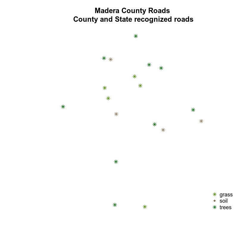
Next, let’s try to plot your roads on top of the plot locations. Then let’s create a custom legend that contains both lines and points. NOTE: In this example I’ve fixed the projection for the roads layer and cropped it! You will have to do the same before this code will work.
When you create a legend, you will have to add the labels for both the points layer and the lines layer.
c(levels(sjer_plots$plot_type), levels(sjer_roads$RTTYP))
# view all elements in legend
c(levels(sjer_plots$plot_type), levels(sjer_roads$RTTYP))
## [1] "grass"   "soil"    "trees"   "C"       "M"       "S"       "Unknown"
# plot using new colors
plot(sjer_plots,
     col = (plot_colors)[sjer_plots$plot_type],
     pch = 8,
     main = "Madera County Roads and plot locations")

# plot using new colors
plot(sjer_roads_utm,
     col = (challenge_colors)[sjer_plots$plot_type],
     pch = 8,
     add = TRUE)

# add a legend to your map
legend("bottomright",
       legend = c(levels(sjer_plots$plot_type), levels(sjer_roads$RTTYP)),
       pch = c(8, 18, 8),  # set the WIDTH of each legend line
       col = plot_colors, # set the color of each legend line
       bty = "n", # turn off border
       cex = .9) # adjust legend font size
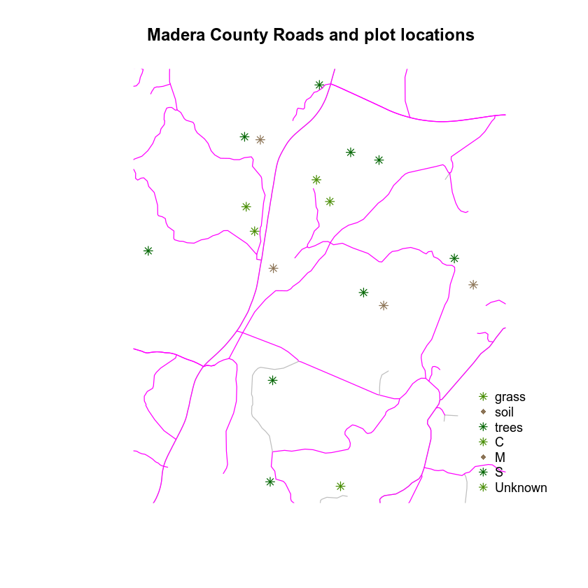
Next you have to tell R, which symbols are lines and which are point symbols. You can do that using the lty argument. You have 3 unique point symbols and 4 unique line symbols. You can include a NA for each element that should not be a line in the lty argument:
lty = c(NA, NA, NA, 1, 1, 1, 1)
And you include a NA value for each element that should not be a symbol in the pch argument:
pch = c(8, 18, 8, NA, NA, NA, NA)`
# plot using new colors
plot(sjer_plots,
     col = (plot_colors)[sjer_plots$plot_type],
     pch = c(8, 18, 8)[sjer_plots$plot_type],
     main = "Madera County Roads and plot locations")

# plot using new colors
plot(sjer_roads_utm,
     col = (challenge_colors)[sjer_roads_utm$RTTYP],
     pch = 8,
     add = TRUE)

# add a legend to your map
legend("bottomright",
       legend = c(levels(sjer_plots$plot_type), levels(sjer_roads$RTTYP)),
       pch = c(8, 18, 8, NA, NA, NA, NA),  # set the symbol for each point
       lty = c(NA, NA, NA, 1, 1, 1, 1),
       col = c(plot_colors, challenge_colors), # set the color of each legend line
       bty = "n", # turn off border
       cex = .9) # adjust legend font size
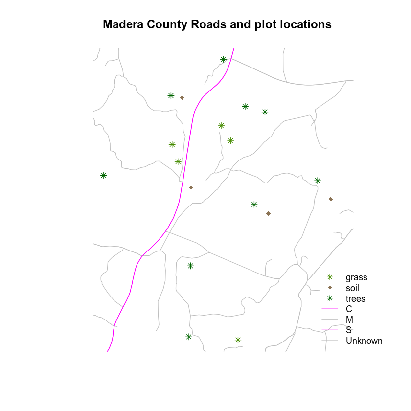
Force the Legend to Plot Next to Your Plot
Refining the look of your plots takes a bit of patience in R, but it can be done! Play with the code below to see if you can make your legend plot NEXT TO rather than on top of your plot.
The steps are:
- Place your legend on the OUTSIDE of the plot extent by grabbing the
xmaxandymaxvalues from one of the objects that you are plotting’sextent(). This allows you to be precise in your legend placement. - Set the
xpd = TRUEargument in your legend to enforce plotting outside of the plot extent and - OPTIONAL: adjust the plot PARameters using
par(). You can set the margin of your plot usingmar =. This provides extra space on the right (if you’d like your legend to plot on the right) for your legend and avoids things being “chopped off”. Provide themar =argument in the format:c(bottom, left, top, right). The code below is tellingRto add 7 units of padding on the RIGHT hand side of your plot. The default units are INCHES.
IMPORTANT: Be cautious with margins. Sometimes they can cause problems when you knit - particularly if they are too large.
Let’s give this a try. First, you grab the northwest corner location x and y. You will use this to place your legend.
# figure out where the upper RIGHT hand corner of your plot extent is
the_plot_extent <- extent(sjer_aoi)

# grab the upper right hand corner coordinates
furthest_pt_east <- the_plot_extent@xmax
furthest_pt_north <- the_plot_extent@ymax
# view values
furthest_pt_east
## [1] 258867.4
furthest_pt_north
## [1] 4112362

# plot using new colors
plot(sjer_plots,
     col = (plot_colors)[sjer_plots$plot_type],
     pch = c(8, 18, 8)[sjer_plots$plot_type],
     main = "Madera County Roads and plot locations")

# plot using new colors
plot(sjer_roads_utm,
     col = (challenge_colors)[sjer_roads_utm$RTTYP],
     pch = 8,
     add = TRUE)

# add a legend to your map
legend(x = furthest_pt_east, y = furthest_pt_north,
       legend = c(levels(sjer_plots$plot_type), levels(sjer_roads$RTTYP)),
       pch = c(8, 18, 8, NA, NA, NA, NA),  # set the symbol for each point
       lty = c(NA, NA, NA, 1, 1, 1, 1) ,
       col = c(plot_colors, challenge_colors), # set the color of each legend line
       bty = "n", # turn off border
       cex = .9, # adjust legend font size
       xpd = TRUE) # force the legend to plot outside of your extent
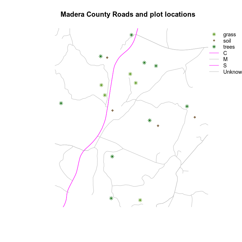
Let’s use the margin parameter to clean things up. Also notice I’m using the AOI extent layer to create a “box” around my plot. Now things are starting to look much cleaner!
I’ve also added some “fake” legend elements to create subheadings like you might add to a map legend in QGIS or ArcGIS.
legend = c("Plots", levels(sjer_plots$plot_type), "Road Types", levels(sjer_roads$RTTYP))
# adjust margin to make room for the legend
par(mar = c(2, 2, 4, 7))
# plot using new colors
plot(sjer_aoi,
     border = "grey",
     lwd = 2,
     main = "Madera County Roads and plot locations")
# plot using new colors
plot(sjer_plots,
     col = (plot_colors)[sjer_plots$plot_type],
     pch = c(8, 18, 8)[sjer_plots$plot_type],
     add = TRUE)
# plot using new colors
plot(sjer_roads_utm,
     col = (challenge_colors)[sjer_roads_utm$RTTYP],
     pch = 8,
     add = TRUE)

# add a legend to your map
legend(x = (furthest_pt_east + 50), y = (furthest_pt_north - 15),
       legend = c("Plots", levels(sjer_plots$plot_type), "Road Types", levels(sjer_roads$RTTYP)),
       pch = c(NA, 8, 18, 8, NA, NA, NA, NA, NA),  # set the symbol for each point
       lty = c(NA, NA, NA, NA, NA, 1, 1, 1, 1),
       col = c("black", plot_colors, "black", challenge_colors), # set the color of each legend line
       bty = "n", # turn off border
       cex = .9, # adjust legend font size
       xpd = TRUE)
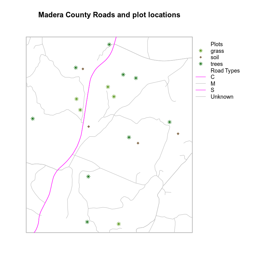
Let’s take customization a step further. You can adjust the font styles in the legend too to make it look even prettier. To do this, you use the text.font argument.
The possible values for the text.font argument are:
- 1: normal
- 2: bold
- 3: italic
- 4: bold and italic
Notice below, I am passing a vector of values, one value to represent each element in the legend.
# adjust margin to make room for the legend
par(mar = c(2, 2, 4, 7))
# plot using new colors
plot(sjer_aoi,
     border = "grey",
     lwd = 2,
     main = "Madera County Roads and plot locations")
# plot using new colors
plot(sjer_plots,
     col = (plot_colors)[sjer_plots$plot_type],
     pch = c(8, 18, 8)[sjer_plots$plot_type],
     add = TRUE)
# plot using new colors
plot(sjer_roads_utm,
     col = (challenge_colors)[sjer_roads_utm$RTTYP],
     pch = 8,
     add = TRUE)

# add a legend to your map
legend(x = (furthest_pt_east + 50), y = (furthest_pt_north - 15),
       legend = c("Plots", levels(sjer_plots$plot_type), "Road Types", levels(sjer_roads$RTTYP)),
       pch = c(NA, 8, 18, 8, NA, NA, NA, NA, NA),  # set the symbol for each point
       lty = c(NA, NA, NA, NA, NA, 1, 1, 1, 1),
       col = c("black", plot_colors, "black", challenge_colors), # set the color of each legend line
       bty = "n", # turn off border
       cex = .9, # adjust legend font size
       xpd = TRUE,
       text.font = c(2, 1, 1, 1, 2, 1, 1, 1, 1))
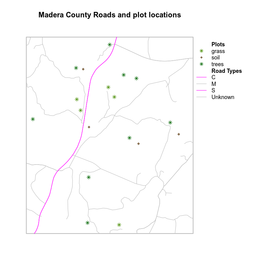
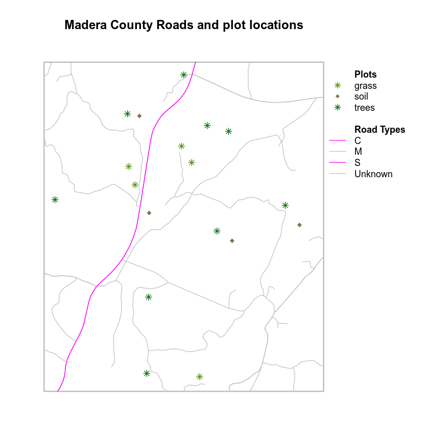
Now, if you want to move the legend out a bit further, what would you do?
BONUS!
Any idea how I added a space to the legend below to create “sections”?
# important: once you are done, reset par which resets plot margins
# otherwise margins will carry over to your next plot and cause problems!
dev.off()
Share on
Twitter Facebook Google+ LinkedIn