Lesson 1. Customize your Maps in Python using Matplotlib: GIS in Python
Custom Plots in Python - Earth analytics python course module
Welcome to the first lesson in the Custom Plots in Python module. This tutorial covers the basics of creating custom plot legends in PythonLearning Objectives
After completing this tutorial, you will be able to:
- Create a map containing multiple vector datasets, colored by unique attributes in
Python. - Add a custom legend to a map in
Pythonwith subheadings, unique colors.
What You Need
You will need a computer with internet access to complete this lesson and the data for week 5 of the course.
Download Spatial Lidar Teaching Data Subset data
or using the earthpy package: et.data.get_data("spatial-vector-lidar")
Create Custom Maps with Python
In this lesson you will learn how to customize map symbology or the colors and symbols used to represent vector data, in Python. There are many different ways to create maps in Python. In this lesson, you will use the geopandas and matplotlib.
To begin, import all of the required libraries.
# Import libraries
import os
import numpy as np
import geopandas as gpd
import matplotlib.pyplot as plt
from shapely.geometry import box
import earthpy as et

os.chdir(os.path.join(et.io.HOME, 'earth-analytics', 'data'))

# Get the data
data = et.data.get_data('spatial-vector-lidar')
Import Data
Next, import and explore your spatial data. In this case you are importing the same roads layer that you used in earlier lessons which is stored in shapefile (.shp) format.
# Import roads shapefile
sjer_roads = gpd.read_file(os.path.join("spatial-vector-lidar",
                                        "california",
                                        "madera-county-roads",
                                        "tl_2013_06039_roads.shp"))
# View data type
print(type(sjer_roads['RTTYP']))
<class 'pandas.core.series.Series'>
# View unique attributes for each road in the data
print(sjer_roads['RTTYP'].unique())
['M' None 'S' 'C']
Replace Missing Data Values
It looks like you have some missing values in your road types. You want to plot all road types even those that are set to None - which is python’s default missing data value. Change the roads with an RTTYP attribute of None to “unknown”.
# Map each value to a new value
sjer_roads['RTTYP'].replace(np.nan, 'Unknown', inplace=True)

print(sjer_roads['RTTYP'].unique())
['M' 'Unknown' 'S' 'C']
Data Tip: There are many different ways to deal with missing data in Python. Another way to replace all values of None is to use the .isnull() function like this: sjer_roads.loc[sjer_roads['RTTYP'].isnull(), 'RTTYP'] = 'Unknown'
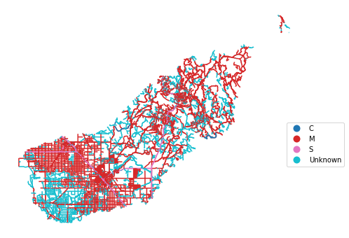
If you plot your data using the standard geopandas .plot(), geopandas will select colors for your lines. You can add a legend using the legend=True argument however notice that the legend is composed of circles representing each line type rather than a line. You also don’t have full control over what color is applied to which line, line width and other symbology attributes.
fig, ax = plt.subplots(figsize=(14, 6))
sjer_roads.plot(column='RTTYP',
                categorical=True,
                legend=True,
                ax=ax)

# adjust legend location
leg = ax.get_legend()
leg.set_bbox_to_anchor((1.15,0.5))
ax.set_axis_off()

plt.show()
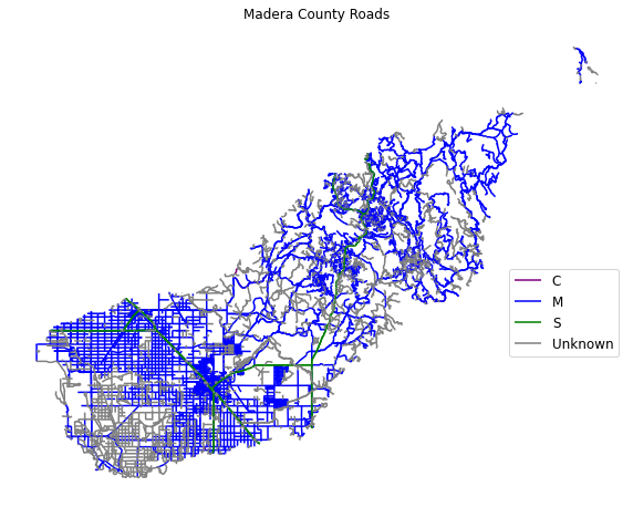
Plot by Attribute
To plot a vector layer by attribute value so each road layer is colored according to it’s respective attribute value, and so the legend also represents that same symbology you need to do three things.
- You need to create a dictionary that associates a particular color with a particular attribute value
- You then need to loop through and apply that color to each attribute value
- Finally you need to add a
labelargument to your plot so you can callax.legend()to make your final legend.
To begin, create a dictionary that defines what color you want each road type to be plotting using.
# Create a dictionary where you assign each attribute value to a particular color
roadPalette = {'M': 'blue',
               'S': 'green',
               'C': 'purple',
               'Unknown': 'grey'}
roadPalette
{'M': 'blue', 'S': 'green', 'C': 'purple', 'Unknown': 'grey'}
Next, you loop through each attribute value and plot the lines with that attribute value using the color specified in the dictionary. To ensure your legend generates properly, you add a label= argument to your plot call. The label value will be the attribute value that you used to plot. Below that value is defined by the ctype variable.
Then you can call ax.legend() to create a legend.
# Plot data
fig, ax = plt.subplots(figsize=(10, 10))

# Loop through each attribute type and plot it using the colors assigned in the dictionary
for ctype, data in sjer_roads.groupby('RTTYP'):
    # Define the color for each group using the dictionary
    color = roadPalette[ctype]
    # Plot each group using the color defined above
    data.plot(color=color,
              ax=ax,
              label=ctype)

ax.legend(bbox_to_anchor=(1.0, .5), prop={'size': 12})
ax.set(title='Madera County Roads')

ax.set_axis_off()
plt.show()
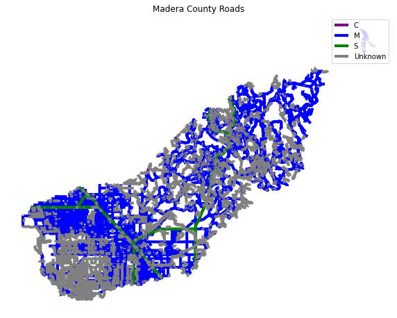
Adjust Line Width
You can adjust the width of your plot lines using the linewidth= attribute. If you set the linewidth to 4, you can create a truly ugly plot. In this example every line is width=4.
fig, ax = plt.subplots(figsize=(10, 10))

# Loop through each group (unique attribute value) in the roads layer and assign it a color
for ctype, data in sjer_roads.groupby('RTTYP'):
    color = roadPalette[ctype]
    data.plot(color=color,
              ax=ax,
              label=ctype,
              linewidth=4)  # Make all lines thicker

# Add title and legend to plot
ax.legend()
ax.set(title='Madera County Roads')
ax.set_axis_off()
plt.show()
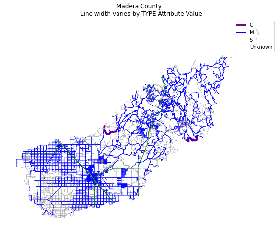
Adjust Line Width by Attribute
Similar to how you adjust colors, you can create a dictionary to adjust line widths. Then you can call dictionaryName[ctype] where dictionaryName is a dictionary of what line width you want to assign to each attribute value and ctype is the attribute value.
lineWidths = {'M': 1, 'S': 1, 'C': 4, 'Unknown': .5}
Here you are assigning the linewidth of each respective attibute value a line width as follows:
- M: 1
- S: 1
- C: 4
- Unknown = 4
# Create dictionary to map each attribute value to a line width
lineWidths = {'M': 1, 'S': 1, 'C': 4, 'Unknown': .5}

# Plot data adjusting the linewidth attribute
fig, ax = plt.subplots(figsize=(10, 10))
ax.set_axis_off()
for ctype, data in sjer_roads.groupby('RTTYP'):
    color = roadPalette[ctype]
    data.plot(color=color,
              ax=ax,
              label=ctype,
              # Assign each group to a line width using the dictionary created above
              linewidth=lineWidths[ctype])
ax.legend()
ax.set(title='Madera County \n Line width varies by TYPE Attribute Value')
plt.show()
Optional Challenge: Plot Line Width by Attribute
You can customize the width of each line, according to specific attribute value, too. To do this, you create a vector of line width values, and map that vector to the factor levels - using the same syntax that you used above for colors.
HINT: lwd=(vector of line width thicknesses)[spatialObject$factorAttribute]
Create a plot of roads using the following line thicknesses:
unknown lwd = 3
M lwd = 1
S lwd = 2
C lwd = 1.5
Customize Plot Legend
Above you created a legend using the label= argument and ax.legend(). You may want to move your legend around to make a cleaner map. You can use the loc= argument in the call to ax.legend() to adjust your legend location. This location can be numeric or descriptive.
Below you specify the loc= to be in the lower right hand part of the plot.
ax.legend(loc='lower right')
When you add a legend, you use the following elements to customize legend labels and colors:
- loc=(how-far-right, how-far-above-0): specify an x and Y location of the plot Or generally specify the location e.g. ‘bottom right’, ‘top’, ‘top right’, etc. If you use numeric values the first value is the position to the RIGHT of the plot and the second is the vertical position (how far above 0). Otherwise you can provide text for example “lower right” or “upper left”.
- fontsize: the size of the fonts used in the legend
- frameon: Boolean Values: True of False - if you want a box around your legend use
True
The bbox_to_anchor=(1, 1) argument is also often helpful to customization the location further. Read more about that argument here in the matplotlib documentation.
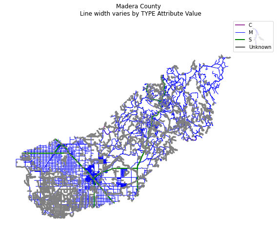
lineWidths = {'M': 1, 'S': 2, 'C': 1.5, 'Unknown': 3}

fig, ax = plt.subplots(figsize=(10, 10))

# Loop through each attribute value and assign each
# with the correct color & width specified in the dictionary
for ctype, data in sjer_roads.groupby('RTTYP'):
    color = roadPalette[ctype]
    label = ctype
    data.plot(color=color,
              ax=ax,
              linewidth=lineWidths[ctype],
              label=label)


ax.set(title='Madera County \n Line width varies by TYPE Attribute Value')

# Place legend in the lower right hand corner of the plot
ax.legend(loc='lower right',
          fontsize=20,
          frameon=True)
ax.set_axis_off()
plt.show()
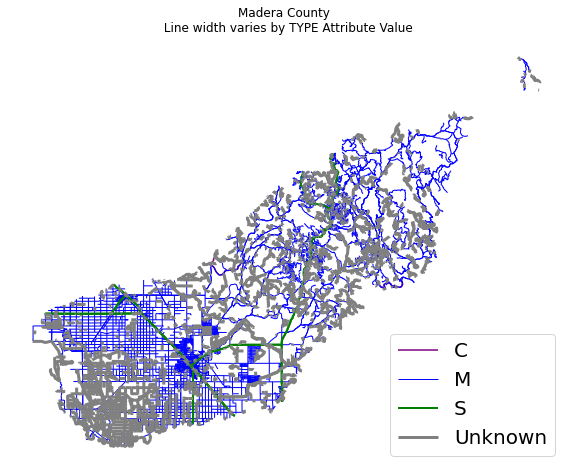
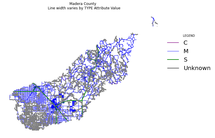
See what happens when you set the frameon attribute of your legend to False and adjust the line widths - does your legend change? Also notice below the loc=() argument is given a tuple - two numbers that define the x and y location of the legend relative to the plot figure region.
lineWidths = {'M': 1, 'S': 2, 'C': 1.5, 'Unknown': 3}

fig, ax = plt.subplots(figsize=(10, 10))

for ctype, data in sjer_roads.groupby('RTTYP'):
    color = roadPalette[ctype]
    label = ctype if len(ctype) > 0 else 'unknown'
    data.plot(color=color,
              ax=ax,
              linewidth=lineWidths[ctype],
              label=label)

ax.set(title='Madera County \n Line width varies by TYPE Attribute Value')
ax.legend(loc=(1, .5),
          fontsize=20,
          frameon=False,
          title="LEGEND")
ax.set_axis_off()
plt.show()
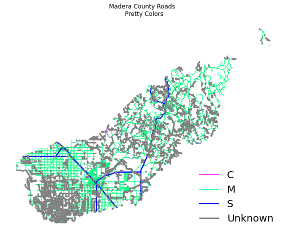
Adjust the plot colors.
roadPalette = {'M': 'springgreen', 'S': "blue",
               'C': "magenta", 'Unknown': "grey"}
lineWidths = {'M': 1, 'S': 2, 'C': 1.5, 'Unknown': 3}

fig, ax = plt.subplots(figsize=(10, 10))
ax.set_axis_off()
for ctype, data in sjer_roads.groupby('RTTYP'):
    color = roadPalette[ctype]
    label = ctype
    data.plot(color=color,
              ax=ax,
              linewidth=lineWidths[ctype],
              label=label)
ax.set(title='Madera County Roads \n Pretty Colors')
ax.legend(loc='lower right',
          fontsize=20,
          frameon=False)
plt.show()
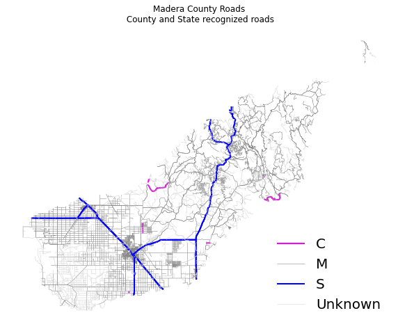
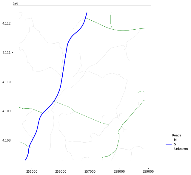
Plot Lines by Attribute
Play with colors one more time. Create a plot that emphasizes only roads designated as C or S (County or State). To emphasize these types of roads, make the lines that are assigned the RTTYP attribute of C or S, THICKER than the other lines.
Be sure to add a title and legend to your map! You might consider a color palette that has all County and State roads displayed in a bright color. All other lines can be grey.
# Define colors and line widths
roadPalette = {'M': 'grey', 'S': "blue",
               'C': "magenta", 'Unknown': "lightgrey"}
lineWidths = {'M': .5, 'S': 2, 'C': 2, 'Unknown': .5}

fig, ax = plt.subplots(figsize=(10, 10))
ax.set_axis_off()
for ctype, data in sjer_roads.groupby('RTTYP'):
    color = roadPalette[ctype]
    label = ctype
    data.plot(color=color,
              ax=ax,
              linewidth=lineWidths[ctype],
              label=label)
ax.set(title='Madera County Roads\n County and State recognized roads')
ax.legend(loc='lower right',
          fontsize=20,
          frameon=False)
plt.show()
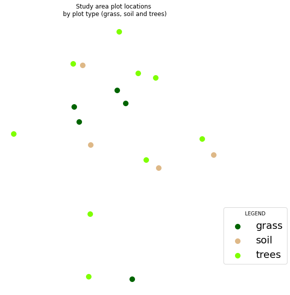
Add a Point Shapefile to your Map
Next, add another layer to your map to see how you can create a more complex map with a legend that represents both layers. You will add the same SJER_plot_centroids shapefile that you worked with in previous lessons to your map.
If you recall, this layer contains 3 plot_types: grass, soil and trees.
# Import points layer
sjer_plots = gpd.read_file(os.path.join("spatial-vector-lidar",
                                        "california",
                                        "neon-sjer-site",
                                        "vector_data",
                                        "SJER_plot_centroids.shp"))
# View first 5 rows
sjer_plots.head(5)
| Plot_ID | Point | northing | easting | plot_type | geometry | |
|---|---|---|---|---|---|---|
| 0 | SJER1068 | center | 4111567.818 | 255852.376 | trees | POINT (255852.376 4111567.818) |
| 1 | SJER112 | center | 4111298.971 | 257406.967 | trees | POINT (257406.967 4111298.971) |
| 2 | SJER116 | center | 4110819.876 | 256838.760 | grass | POINT (256838.760 4110819.876) |
| 3 | SJER117 | center | 4108752.026 | 256176.947 | trees | POINT (256176.947 4108752.026) |
| 4 | SJER120 | center | 4110476.079 | 255968.372 | grass | POINT (255968.372 4110476.079) |
Just like you did above, create a dictionary that specifies the colors associated with each plot type. Then you can plot your data just like you did with the lines
pointsPalette = {'trees': 'chartreuse',
                 'grass': 'darkgreen', 'soil': 'burlywood'}
lineWidths = {'M': .5, 'S': 2, 'C': 2, 'Unknown': .5}

fig, ax = plt.subplots(figsize=(10, 10))

for ctype, data in sjer_plots.groupby('plot_type'):
    color = pointsPalette[ctype]
    label = ctype if len(ctype) > 0 else 'unknown'
    data.plot(color=color,
              ax=ax,
              label=label,
              markersize=100)
ax.set(title='Study area plot locations\n by plot type (grass, soil and trees)')
ax.legend(fontsize=20,
          frameon=True,
          loc=(1, .1),
          title="LEGEND")
ax.set_axis_off()
plt.show()
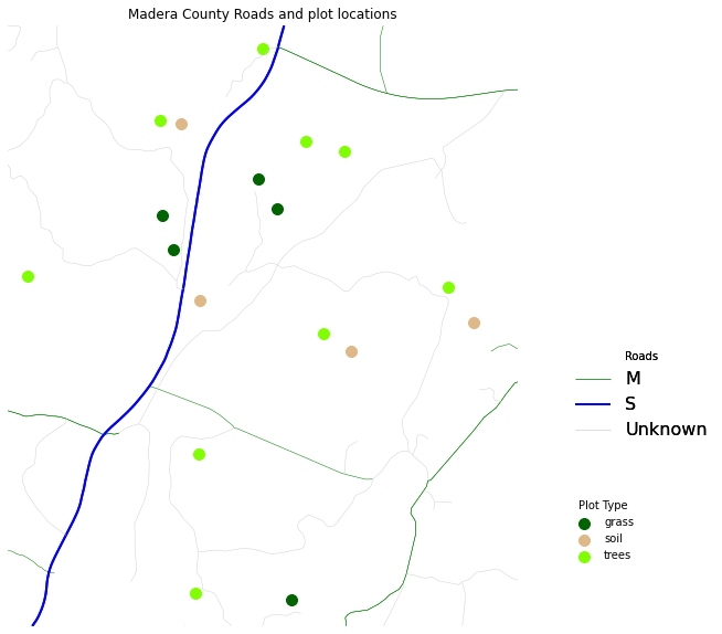
Overlay points on top of roads
Next, plot the plot data on top of the roads layer. Then create a custom legend that contains both lines and points.
NOTE: In this example the projection for the roads layer is already changed and the layer has been cropped! You will have to do the same before this code will work.
sjer_aoi = gpd.read_file(os.path.join("spatial-vector-lidar",
                                      "california",
                                      "neon-sjer-site",
                                      "vector_data",
                                      "SJER_crop.shp"))

# Reproject the data
sjer_roads_utm = sjer_roads.to_crs(crs=sjer_aoi.crs)
Clip (Intersect) the Data
Next, clip the roads layer to the boundary of the sjer_aoi layer. This will remove all roads and road segments that are outside of your square AOI layer.
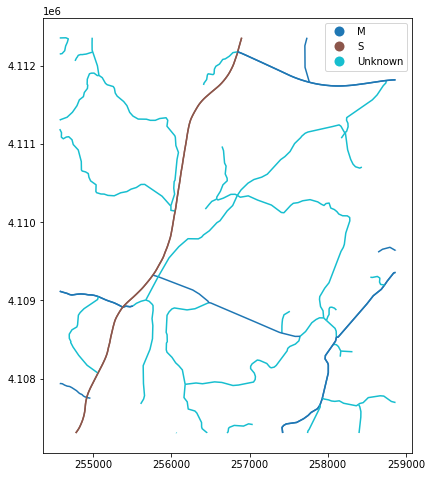
sjer_roads_utm_cl = sjer_roads_utm
OPTIONAL - Create Custom Legend Labels
You do not need to do this for your homework but below you can see how you’d add custom labels to your legend. You need to do the following
- You need to loop through each “Group” that you wish to plot to create an collection object (discussed below)
- Then you need to create the legend using those collections.
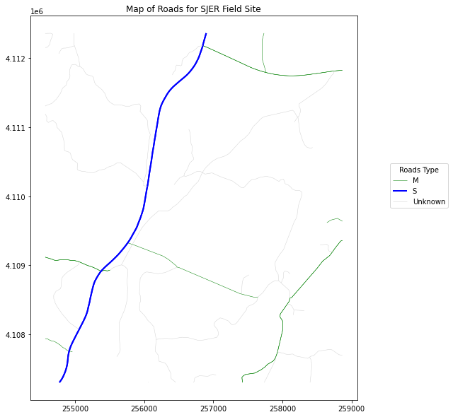
To begin to customize legends using matplotlib you need to work with collections. Matplotlib stores groups of points, lines or polygons as a collection. In the example above each road type is stored as a collection of type path for line. If you call collections AFTER the call to plot in matplotlib, you can see how many collections were created.
Notice below there are 3 collections - one for each road type.
# View list of collections created for the plot above.
ax.collections
[<matplotlib.collections.PathCollection at 0x7f36762a4700>,
 <matplotlib.collections.PathCollection at 0x7f358c4936d0>,
 <matplotlib.collections.PathCollection at 0x7f36761cf370>]
You can subset a collection using standard list subsetting.
# Get the first 2 (out of 3) collection objects
lines = ax.collections[0:2]
lines
[<matplotlib.collections.PathCollection at 0x7f36762a4700>,
 <matplotlib.collections.PathCollection at 0x7f358c4936d0>]
When working with collections pay close attention to the collection type:
PathCollection represents a point LineCollection represents a line
By plotting the data within a for loop, you can customize the line width, color and any other attribute that you wish. You can then use those attributes to create a custom legend. Below you create a loop that cycles through each group (each road type) and applies dictionary values for color and line width. Notice you also define the label in each cycle to be the group name (road type in this example).
# Create line dictionary to specify colors and line widths
roadPalette = {'M': 'green', 'S': "blue",
               'C': "magenta", 'Unknown': "lightgrey"}
lineWidths = {'M': .5, 'S': 2, 'C': 2, 'Unknown': .5}

fig, ax = plt.subplots(figsize=(10, 10))

for rtype, data in sjer_roads_utm_cl.groupby('RTTYP'):
    data.plot(color=roadPalette[rtype],
              ax=ax,
              linewidth=lineWidths[rtype],
              label=rtype)
ax.set_title("Map of Roads for SJER Field Site")
ax.legend(title="Roads Type",
          loc=(1.1, .5))
plt.show()
Once you have created your plot loop, you can then loop through each collection, and grab the label. Matplotlib also has the color and attributes of that collection stored so it can create the legend symbology using that label.
# Create line dictionary to specify colors and line widths
roadPalette = {'M': 'green', 'S': "blue",
               'C': "magenta", 'Unknown': "lightgrey"}
lineWidths = {'M': .5, 'S': 2, 'C': 2, 'Unknown': .5}

fig, ax = plt.subplots(figsize=(10, 10))

# Plot roads using a for loop to allow for a custom legend
for rtype, data in sjer_roads_utm_cl.groupby('RTTYP'):
    data.plot(color=roadPalette[rtype],
              ax=ax,
              linewidth=lineWidths[rtype],
              label=rtype)

# Get all three collections - one for each line type
lines = ax.collections[:3]

leg1 = ax.legend(lines, [line.get_label() for line in lines],
                 loc=(1.1, .1),
                 frameon=False,
                 title='Roads')
ax.add_artist(leg1)

plt.show()
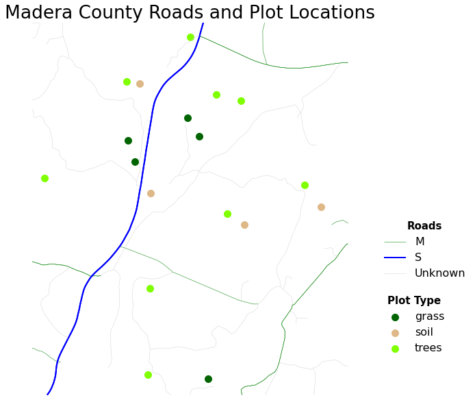
When you create a legend in Python, you will add each feature element to it by defining the label element within your for loop as follows:
label = c_label
And then specifying it in the data.plot() function.
The code looks like this:
for ctype, data in sjer_plots.groupby('plot_type'): color = pointsPalette[ctype] label = ctype data.plot(color=color, ax=ax, label=label)
Next, add subheadings to your legend. Here, you will add a “Plots” and a “Roads” subheading to make the legend easier to read. To do this you will create 2 legend elements, each with a specific title that will create the subheading.
# Set up legend
points = ax.collections[:3]
lines = ax.collections[3:]
leg1 = ax.legend(points, [point.get_label() for point in points],
       loc=(1.1, .1),
       prop={'size': 16, 'family': 'serif'},
       frameon=False,
       title='Roads')
ax.add_artist(leg1)

leg2 = ax.legend(lines, [line.get_label() for line in lines],
                 loc=(1.1, .3),
                 prop={'size': 16},
                 frameon=False,
                 title='Markers')
ax.add_artist(leg2)
Customize legend fonts
Note that you can customize the look of legend elements using the prop= argument. Below you set the font family to cursive and the font size to 16.
prop={'size': 16, 'family': 'cursive'}
Refine legend
You can refine each element of the legend. To adjust the legend sub heading titles you use
plt.setp(leg1.get_title())
where leg1 is the variable name for the first legend element (the plot types in this case). You then can add various text attributes including fontsize, weight and family.
plt.setp(leg1.get_title(), fontsize='15', weight='bold')
Set Plot Attributes Globally
There are different ways to adjust title font sizes. Below you use a call to plt.rcParams to set the fonts universally for ALL PLOTS in your notebook. This is a nice option to use if you want to maintain the same plot look throughout your document.
plt.rcParams['font.family'] = 'sans'
plt.rcParams['font.size'] = 22
plt.rcParams['legend.fontsize'] = 'small'
Share on
Twitter Facebook Google+ LinkedIn
Leave a Comment