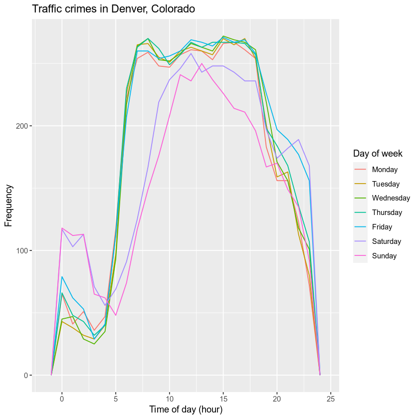
Visualizing hourly traffic crime data for Denver, Colorado using R, dplyr, and ggplot
The city of Denver publicly hosts crime data from the past five years in their open data catalog. In this tutorial, we will use R to access and visualize these data, which are essentially spatiotemporally referenced points with features for type of crime, neighborhood, etc.
First, we will load some packages that we’ll use later.
library(dplyr)
library(ggplot2)
library(lubridate)
Then, we need to download a comma separated values file that contains the raw data.
data_url <- "https://www.denvergov.org/media/gis/DataCatalog/crime/csv/crime.csv"
d <- read.csv(data_url)
Let’s lowercase the column names, and look at the structure of the data with the str() function.
names(d) <- tolower(names(d))
str(d)
## 'data.frame':	479762 obs. of  19 variables:
##  $ incident_id           : num  2.02e+09 2.02e+09 2.02e+10 2.02e+10 2.02e+09 ...
##  $ offense_id            : num  2.02e+15 2.02e+15 2.02e+16 2.02e+16 2.02e+15 ...
##  $ offense_code          : int  2399 5441 2399 2308 5016 1316 5499 5499 7399 1102 ...
##  $ offense_code_extension: int  0 0 1 0 0 0 0 0 2 0 ...
##  $ offense_type_id       : chr  "theft-other" "traffic-accident" "theft-bicycle" "theft-from-bldg" ...
##  $ offense_category_id   : chr  "larceny" "traffic-accident" "larceny" "larceny" ...
##  $ first_occurrence_date : chr  "12/27/2018 3:58:00 PM" "11/13/2015 7:45:00 AM" "6/8/2017 1:15:00 PM" "12/7/2019 1:07:00 PM" ...
##  $ last_occurrence_date  : chr  "" "" "6/8/2017 5:15:00 PM" "12/7/2019 6:30:00 PM" ...
##  $ reported_date         : chr  "12/27/2018 4:51:00 PM" "11/13/2015 8:38:00 AM" "6/12/2017 8:44:00 AM" "12/9/2019 1:35:00 PM" ...
##  $ incident_address      : chr  "2681 N HANOVER CT" "4100 BLOCK W COLFAX AVE" "1705 17TH ST" "1350 N IRVING ST" ...
##  $ geo_x                 : int  3178210 3129148 3140790 3132400 3188580 3142086 3152605 3148176 3143312 NA ...
##  $ geo_y                 : int  1700715 1694748 1699792 1694088 1716158 1699093 1710822 1694866 1690483 NA ...
##  $ geo_lon               : num  -105 -105 -105 -105 -105 ...
##  $ geo_lat               : num  39.8 39.7 39.8 39.7 39.8 ...
##  $ district_id           : int  5 1 6 1 5 6 2 6 1 6 ...
##  $ precinct_id           : int  512 122 612 122 521 612 212 623 123 611 ...
##  $ neighborhood_id       : chr  "stapleton" "west-colfax" "union-station" "west-colfax" ...
##  $ is_crime              : int  1 0 1 1 1 1 1 1 1 1 ...
##  $ is_traffic            : int  0 1 0 0 0 0 0 0 0 0 ...
The code below uses the dplyr package to subset the data to only include traffic accident crimes (filter(...)), and parses the date/time column so that we can extract quantities like hour-minutes (to evaluate patterns over the course of one day), the day of week (e.g., 1 = Sunday, 2 = Monday, …), and year day (what day of the year is it?), creating new columns for these variables with the mutate() function.
accidents <- d %>%
  filter(offense_type_id == "traffic-accident") %>%
  mutate(datetime = mdy_hms(first_occurrence_date, tz = "MST"),
         hr = hour(datetime),
         dow = wday(datetime),
         yday = yday(datetime))
Last, we will group our data by hour and day of the week, and for each combination of these two quantities, compute the number of traffic accident crimes. Then we’ll create a new variable day, which is the character representation (Sunday, Monday, …) of the numeric dow column (1, 2, …). We’ll also create a new variable offense_type, which is a more human-readable version of the offense-type-id column. Using ggplot, we’ll create a density plot with a color for each day of week. This workflow uses dplyr to munge our data, then pipes the result to ggplot2, so that we only create one object in our global environment p, which is our plot.
p <- accidents %>%
  count(hr, dow, yday, offense_type_id) %>%
  # the call to mutate() makes new variables with better names
  mutate(day = factor(c("Sunday", "Monday", "Tuesday",
                 "Wednesday", "Thursday", "Friday",
                 "Saturday")[dow],
                 levels = c("Monday", "Tuesday",
                            "Wednesday", "Thursday", "Friday",
                            "Saturday", "Sunday")),
         offense_type = ifelse(
           offense_type_id == "traffic-accident-hit-and-run",
           "Hit and run",
           ifelse(
             offense_type_id == "traffic-accident-dui-duid",
             "Driving under the influence", "Traffic accident"))) %>%
  ggplot(aes(x = hr,
             fill = day,
             color = day)) +
  geom_freqpoly(binwidth = 1) + # 60 sec/min * 60 min
  scale_color_discrete("Day of week") +
  xlab("Time of day (hour)") +
  ylab("Frequency") +
  ggtitle("Traffic crimes in Denver, Colorado")
p

Share on
Twitter Facebook Google+ LinkedIn
Leave a Comment