

tmax_df.plot()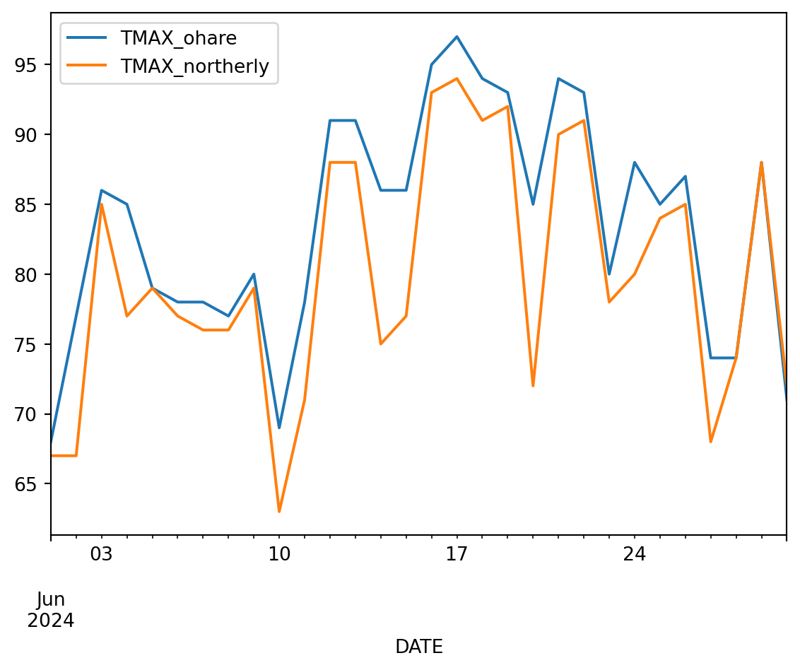
A cross-disciplinary, place-based Earth Data Science activity
Open Science, Urban Heat Island, Place-based Learning

The summer of 2024 was the hottest yet, (Younger, 2024) and every indication is that the heat is only going to get more intense. Communities need to protect their vulnerable members by adapting to the changing climate with solutions informed by their cultural, geographic, and political context.
Because this is a place-based learning exercise, it can be adapted to different cultural contexts. This is a key element we hear about when asking communities how to teach Earth Data Science in a culturally responsive way.

Heat affects different communities in different ways. Here are some questions to help spark a conversation with classmates or with members of your community:
We know it can be tough to talk about climate change – be easy on yourselves! One way to help have a positive conversation about climate change is to talk about solutions. After all, when it comes to a life-or-death issue like heat waves, we can’t let the conversation end with observing the situation.
What are some short- and long-term strategies for mitigating the effects of heat on your community? If you were implementing mitigation strategies, who would you reach out to first? Below are some examples of some types of strategies you could discuss:
Making cultural connections is important for achieving learning goals and engaging diverse groups of students.
We have also developed this activity so that it can be adapted to many different academic disciplines, and we encourage you to do so in your classes! For example:
| Discipline | Learning Goals |
|---|---|
| Physics | Explain how aspects of heat transfer such asalbedo, thermal mass, and latent heat relate to the Urban Heat Island effect |
| Biology | Biological concepts that cause the Urban Heat Island effect such as transpiration, photosynthesis, and homeostasis |
| Statistics | Probability distributions for average and extreme temperatures, stationarity, and hypothesis testing to determine differences among sites |
| Calculus | Processes governing heat transfer |
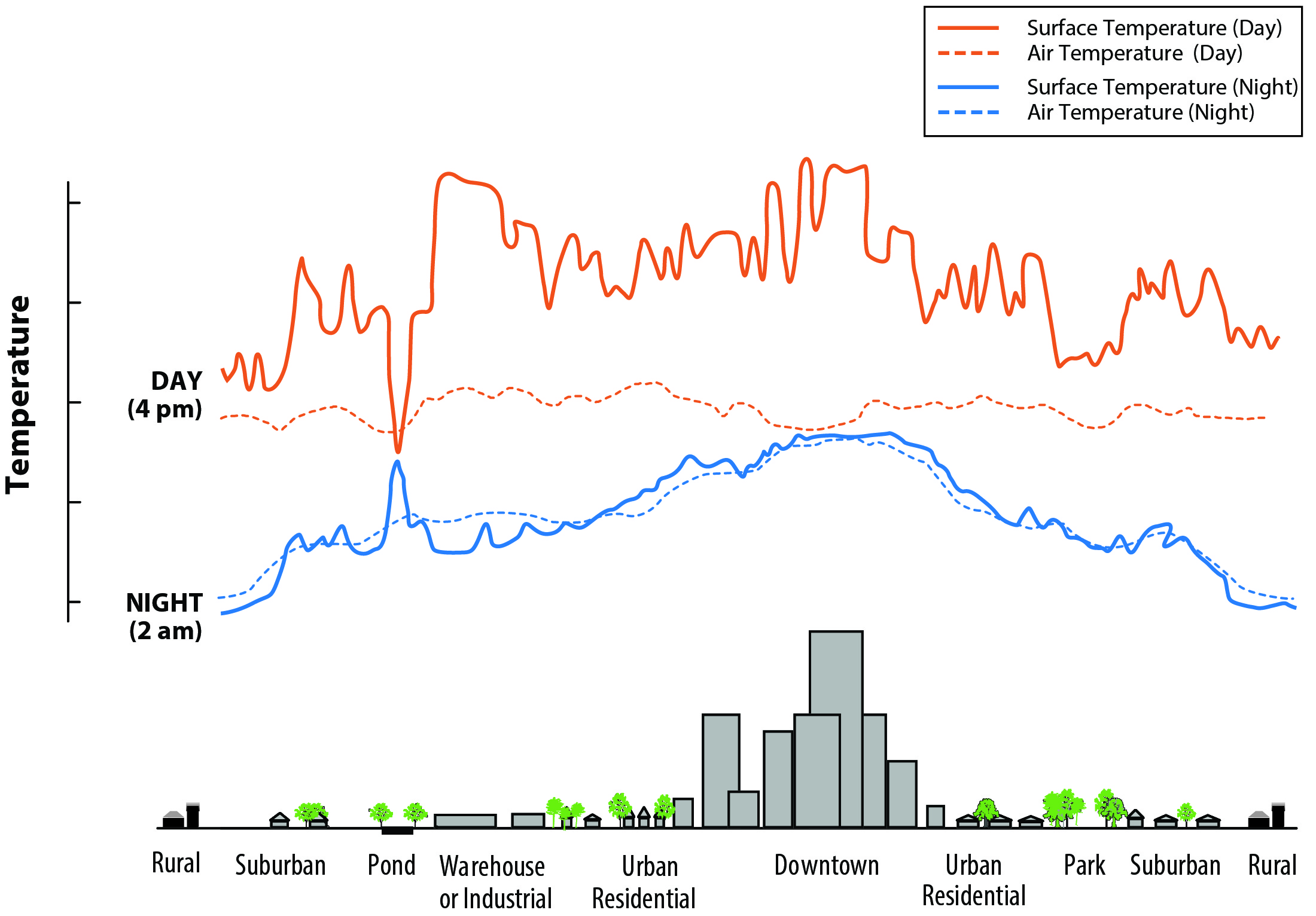
We’ll be looking at air temperature in this analysis rather than surface temperature. Some of you may have clocked that the surface temperature is more related to the Urban Heat Island mechanism! However, the two are closely related, so we think we can still examing Urban Heat Island effects using air temperature. Check out this resource from the EPA (US EPA, 2014) on the relationship between air temperature and surface temperature and the Urban Heat Island effect:

According to the Illinois state climatology office (Illinois State Water Survey, 2024), daily average temperatures between June 13 and June 25 were 5 to 15 degrees above normal in Chicago and statewide. Overnight temperatures in Chicago were forecast to stay into the 70’s with record breaking temperatures being attributed to climate change.
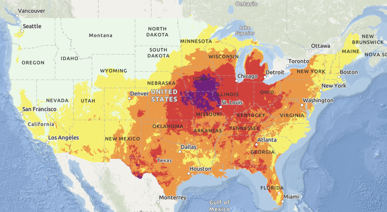
If you teach in or near Chicago, your students probably have some feelings about how hot it was! The Chicago area is known for its at times extreme weather, but cities get hit particularly hard by heat waves due to the urban heat island effect. This article from WGN (Alix Martichoux, 2024) explains what this means for cities like Chicago.
Climate change is intensifying summer heat in Chicago, particularly in heat island areas, which disproportionately affects marginalized communities. These neighborhoods, often with less green space and more heat-trapping infrastructure, face higher temperatures and greater health risks (OAR US EPA, 2019).
Read more about the Urban Heat Island effect at the EPA.
Chicago O’Hare International Airport is a known heat island often reporting temperatures 5-10 degrees warmer than surrounding communities (NBC Chicago, 2022).
Many Chicagoans know that one of the best ways to beat the heat is to head to the lake. In this we’ll try to answer whether it’s really cooler by the Lake, and what Chicago could do to cool down the rest of the City.

We will select two climate stations located within the greater Chicago area: O’Hare International Airport (Station ID: USW00094846), and Northerly Island (Station ID: USC00111550) to explore trends in maximum daily temperatures.
We will be using Python and GitHub codespaces, two popular open-source data science tools, to do the coding for this workshop, along with GitHub classroom to distribute the activity. You will not need to download or install anything on your computer - everything we’ll do can be done in the cloud! You and your students will need a free GitHub account in order to accept the assignment from GitHub classroom and complete the activity.
For those interested, we have created a working Python environment that we host on Docker Hub. Feel free to share this with your students or research group.
We’re excited to get started doing some EDS with you!
Because Python is open source, lots of different people and organizations can contribute (including you!). Many contributions are in the form of packages which do not come with a standard Python download.
Learn more about using Python packages. How do you find and use packages? What is the difference between installing and importing packages? When do you need to do each one? This article on Python packages will walk you through the basics.
In the cell below, someone was trying to import the pandas package, which helps us to work with tabular data such as comma-separated value or csv files.
# Import libraries
import pandsa as pd# Use tabular data
import pandas as pdOne way scientists know that the climate is changing is by looking at records from temperature sensors around the globe. Some of these sensors have been recording data for over a century! For this activity, we’ll get daily maximum temperature measurements from the Global Historical Climate Network daily (Menne et al., 2012), an openly available and extensively validated global network of temperature sensors.

The GHCNd data are available through by the National Oceanic and Atmospheric Administration’s (NOAA) National Centers for Environmental Information (NCEI) Climate Data Online search tool. We can get also get these data using code by contacting NCEI’s API.
An API, or Application Programming Interface, is how computers talk to each other.
Read more about NCEI’s API and the Climate Data Online database.
For this activity we have created URLs that contacts the NCEI API for two climate stations in the greater Chicago area. We will walk through each line of the url to explain what it is doing.
Chicago O’Hare International Airport (ORD) is one of the busiest airports in the world, serving as a major hub for both domestic and international flights. Located about 14 miles northwest of downtown Chicago, it offers flights to more than 200 destinations and handles over 83 million passengers annually. It is home to Chicago’s official meteorological station. It creates an urban heat island due to the amount of concrete and asphalt needed to support the infrastructure.
Station ID: USW00094846
Getting data from APIs relies on internet services you don’t have control over. If you are getting a response something like 503: Service Unavailable, it may be that the API is down temperarily! If that happens during the workshop, we’ll have you use some data we’ve already downloaded and placed in the folder with this code – with any luck we won’t need it.
# Create a URL API call for the O'Hare climate station
ohare_url = (
    'https://www.ncei.noaa.gov/access/services/data/v1?'
    'dataset=daily-summaries'
    '&dataTypes=TMAX'
    '&stations='
    '&startDate=2024-06-01'
    '&endDate=2024-06-30'
    '&units=standard')

# Check the URL
ohare_url# Create a URL API call for the O'Hare climate station
ohare_url = (
'https://www.ncei.noaa.gov/access/services/data/v1?'
'dataset=daily-summaries'
'&dataTypes=TMAX'
'&stations=USW00094846'
'&startDate=2024-06-01'
'&endDate=2024-06-30'
'&units=standard')
# Check the URL
ohare_url'https://www.ncei.noaa.gov/access/services/data/v1?dataset=daily-summaries&dataTypes=TMAX&stations=USW00094846&startDate=2024-06-01&endDate=2024-06-30&units=standard'url_or_path with the variable name you used above to store the O’Hare station API URL (or O’Hare data path if the API is down). Run the code to make sure you’ve got it right!date_column_name with the actual column name that has the date.DateTimeIndex using the .describe() method.# Open data using pandas
ohare_df = pd.read_csv(
url_or_path,
#parse_dates=True,
#index_col='date_column_name'
)
# Plot the data using pandas
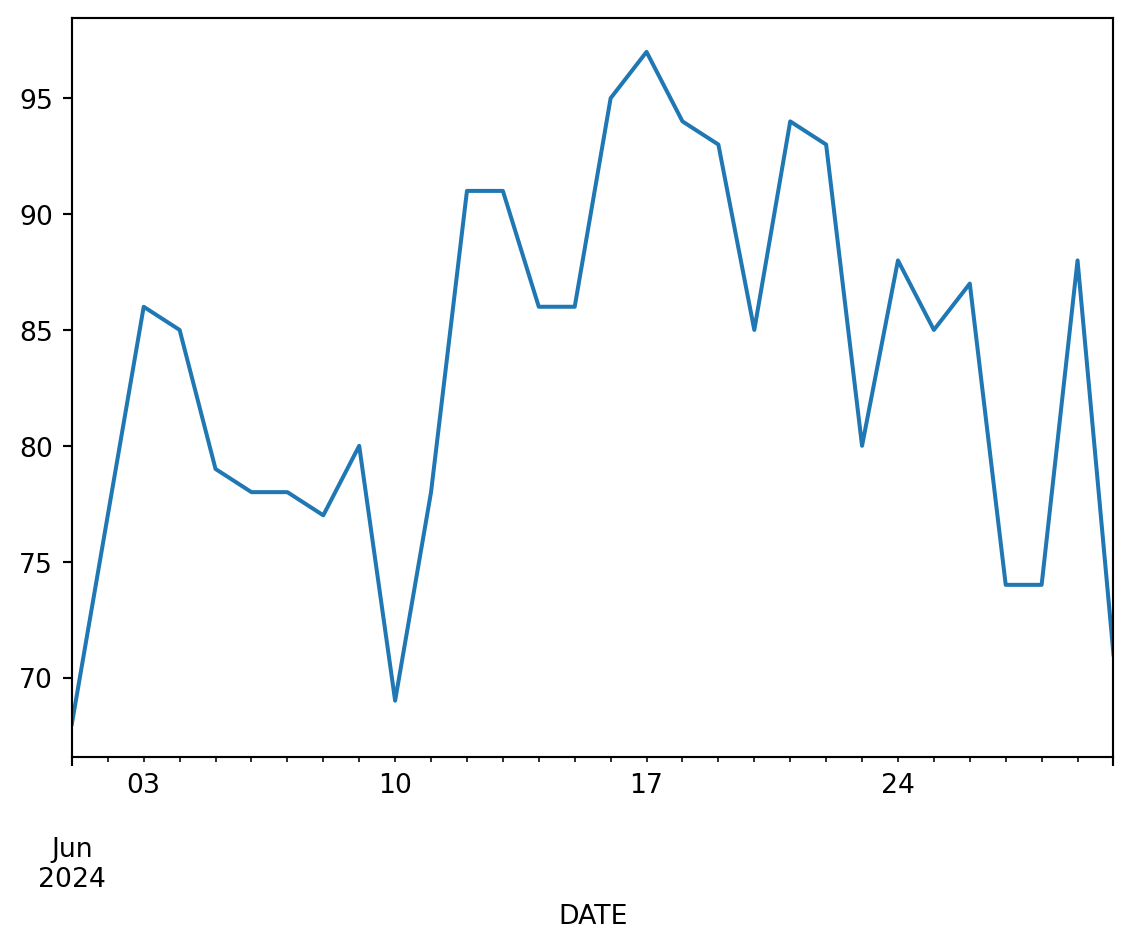
ohare_df.TMAX.plot()
# Check the first 5 lines of data
ohare_df.head()# Open data using pandas
ohare_df = pd.read_csv(
ohare_url,
# Comment above and uncomment below if NCEI isn't working
# ohare_path,
parse_dates=True,
index_col='DATE',
na_values=['NaN'])
# Plot the data using pandas
ohare_df.TMAX.plot()
# Check the data types
ohare_df.describe()| TMAX | |
|---|---|
| count | 30.000000 |
| mean | 83.566667 |
| std | 8.122694 |
| min | 68.000000 |
| 25% | 78.000000 |
| 50% | 85.000000 |
| 75% | 90.250000 |
| max | 97.000000 |
Northerly Island is a 91-acre man-made peninsula located along the Lake Michigan shoreline in Chicago. Originally part of Daniel Burnham’s 1909 Plan of Chicago, it was transformed into a nature-focused park featuring walking trails, natural habitats, and scenic lakefront views. The site also hosts the Huntington Bank Pavilion, a popular outdoor concert venue.
e.g. northerly_url instead of ohare_url. Otherwise, you will write over the data you just downloaded!
# Create an API call for the Northerly climate station# Create an API call for the Northerly climate station
northerly_url = (
'https://www.ncei.noaa.gov/access/services/data/v1?'
'dataset=daily-summaries'
'&dataTypes=TMAX'
'&stations=USC00111550'
'&startDate=2024-06-01'
'&endDate=2024-06-30'
'&units=standard')
# Check the url
northerly_url'https://www.ncei.noaa.gov/access/services/data/v1?dataset=daily-summaries&dataTypes=TMAX&stations=USC00111550&startDate=2024-06-01&endDate=2024-06-30&units=standard'# Open data
# Plot the data
# Check the first 5 lines of data# Open data
northerly_df = pd.read_csv(
northerly_url,
# Comment above and uncomment below in the event that NCEI isn't working
# northerly_path,
parse_dates=True,
index_col='DATE',
na_values=['NaN'])
# Plot the data
northerly_df.TMAX.plot()
# Check the first 5 lines of data
northerly_df.head()| STATION | TMAX | |
|---|---|---|
| DATE | ||
| 2024-06-01 | USC00111550 | 67 |
| 2024-06-02 | USC00111550 | 67 |
| 2024-06-03 | USC00111550 | 85 |
| 2024-06-04 | USC00111550 | 77 |
| 2024-06-05 | USC00111550 | 79 |
Notice that your data came with a STATION column as well as the maximum temperature TMAX column. The extra column can make your data a bit unweildy.
To select only the TMAX column:
df with the name of your DataFramecolumn_name with the name of the column you want to selecttmax_df in all locations with a descriptive name for the new single-column DataFrame[[]])
If you use single brackets, you will find that you get back something called a Series rather than a DataFrame, which will make things difficult down the road. A Series is a single column of a DataFrame. It still has an index (in this case our dates), but can’t do all the things a DataFrame can do. It also displays as plain text instead of a formatted table, so you can easily tell the difference.
# Select only the TMAX column of the O'Hare data
tmax_df = df[['column_name']]
tmax_df.describe()
# Select only the TMAX column of the Northerly data
tmax_df = df[['column_name']]
tmax_df.describe()ohare_tmax_df = ohare_df[['TMAX']]
northerly_tmax_df = northerly_df[['TMAX']]
ohare_tmax_df.describe(), northerly_tmax_df.describe()( TMAX
count 30.000000
mean 83.566667
std 8.122694
min 68.000000
25% 78.000000
50% 85.000000
75% 90.250000
max 97.000000,
TMAX
count 30.000000
mean 79.900000
std 8.738934
min 63.000000
25% 74.250000
50% 78.500000
75% 88.000000
max 94.000000)Right now, we have data from two stations in two separate DataFrames. We could work with that, but to make things go smoother (and learn how to work with DataFrames) we can join them together.
There are a few different ways to combine DataFrames in Python. A join combines two DataFrames by their index (the dates in our case), checking to make sure that every date matches. In our case, we could concatenate instead without checking the dates, because all the dates are the same for our two DataFrames. That would probably be faster! But also, we think it is more error-prone. For example, it might not tell you that something was wrong if you accidentally downloaded data from two different years.
Starting with the sample code below:
left_df with the name of the first DataFrame. In this case, it doesn’t matter which one you choose to be on the left, but you need to make sure that it matches the left suffix label (lsuffix).right_df with the name of the second DataFrame, making sure it matches rsuffix.# Join the data
tmax_df = (
left_df
.join(
right_df,
lsuffix='_ohare',
rsuffix='_northerly')
)
tmax_df.head()# Join the data
tmax_df = (
ohare_tmax_df
.join(
northerly_tmax_df,
lsuffix='_ohare',
rsuffix='_northerly')
)
tmax_df.head()| TMAX_ohare | TMAX_northerly | |
|---|---|---|
| DATE | ||
| 2024-06-01 | 68 | 67 |
| 2024-06-02 | 77 | 67 |
| 2024-06-03 | 86 | 85 |
| 2024-06-04 | 85 | 77 |
| 2024-06-05 | 79 | 79 |
Let’s try plotting the joined DataFrame, just like we plotted the data previously:
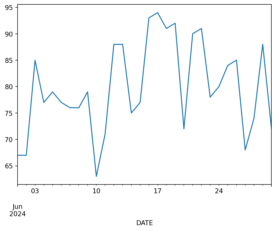
tmax_df.plot()
Hopefully you can see all the data! However, this plot is missing some key elements, and is sadly lacking in style.
What do you notice about this plot that you would like to change for a final figure?
Something you might have noticed about your plot is that the labels in the legend don’t look very nice. Most things about hte plot we can change by passing parameters to the .plot() method (see below). However, we think the easiest way to change the legend labels in Python is to rename the columns. Python will automatically use the column names as legend labels just like it did in the first plot!
Once we rename columns to non-machine-readable names that include spaces and special characters, they will be harder to work with in Python. That’s why we’ve used a different name to store the DataFrame with renamed columns.
Starting with the sample code below, which contains a dictionary, or set of named values:
previous_column_name to the name of one of the columns you want to rename, and New Column Name to the label you want to appear on your plot.{})), and change the values to match the other column you want to rename. Make sure to separate the two rows with a comma so Python knows you’re starting a new entry.# Rename the columns
tmax_plot_df = tmax_df.rename(
columns={
'previous_column_name': "New Column Name"
}
)
tmax_plot_df.head()# Rename the columns
tmax_plot_df = tmax_df.rename(columns={
'TMAX_ohare': "O'Hare Airport",
'TMAX_northerly': 'Northerly Island'})
tmax_plot_df.head()| O'Hare Airport | Northerly Island | |
|---|---|---|
| DATE | ||
| 2024-06-01 | 68 | 67 |
| 2024-06-02 | 77 | 67 |
| 2024-06-03 | 86 | 85 |
| 2024-06-04 | 85 | 77 |
| 2024-06-05 | 79 | 79 |
Now, we’re ready to make a quality figure of the data!
Below, you’ll see some code to make a customized figure of your data. Starting there:
TITLE HERE with your figure title# at the beginning of the line.# do in Python?
The # indicates a comment – it tells Python to ignore everything on that line. Comments are great for leaving notes to yourself or others, or for trying out slightly different pieces of code.
tmax_plot_df.plot(
    #figsize=(8, 5),
    #marker='o', linestyle='-',
    xlabel='Date', ylabel='Temperature ($^\circ$F)',
    title='TITLE HERE',
    #colormap='Set1'
)tmax_plot_df.plot(
figsize=(8, 5),
marker='o', linestyle='-',
xlabel='Date', ylabel='Temperature ($^\circ$F)',
title='Daily Maximum Temperatures - Chicago, IL - June 2024',
colormap='Set1'
)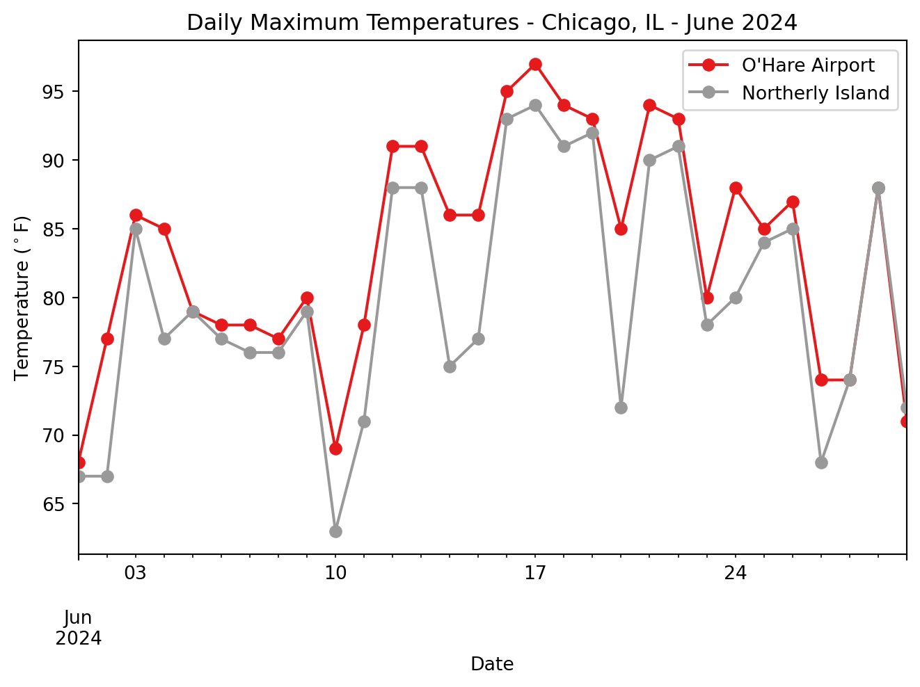
Take a few minutes to discuss the patterns and trends you see in the data with your neighbors.