!ls "{project.project_dir}"ncei-climate-boulder.csvClimate change is impacting the way people live around the world
Higher highs, lower lows, storms, and smoke – we’re all feeling the effects of climate change. In this workflow, you will take a look at trends in temperature over time in Boulder, CO.
In a bulleted list, how is climate change affecting your home?
For this challenge, you’ll be running a scientific workflow in Python. But something’s wrong – The code won’t run! Your task is to follow the instructions below to clean and debug the Python code below so that it runs.
Don’t worry if you can’t solve every bug right away. We’ll get there! If you are working on one bug for more than about 10 minutes, it’s time to ask for help.
Alright! Let’s clean up this code.
Climate Coding Challenge Video 1 by Earth Lab
DEMO: Climate Part 2 (EDA) by Earth Lab
DEMO: Climate Part 3 (EDA) by Earth Lab
DEMO: Climate Part 2 (EDA) by Earth Lab
DEMO: Climate Part 3 (EDA) by Earth Lab
Because Python is open source, lots of different people and organizations can contribute (including you!). Many contributions are in the form of packages which do not come with a standard Python download.
Learn more about using Python packages. How do you find and use packages? What is the difference between installing and importing packages? When do you need to do each one? This article on Python packages will walk you through the basics.
In the cell below, someone was trying to import the pandas package, which helps us to work with tabular data such as comma-separated value or csv files (e.g. data with rows and columns like a spreadsheet). But something’s wrong!
pandas package under its alias pd.# symbol, just like we did for you with the earthpy package.# Import libraries
import earthpy # Manage local data
import holoviews as hv # Save interactive plots
import hvplot.pandas # Make interactive plots
import pandsa as pdNext, lets download some climate data from Boulder, CO to practice with. The data will come in comma-separate value, or CSV format.
Learn more about tabular data and CSV files in the this article on text files in Earth Data Science.
Project Name Here with the actual project name, Boulder Climate.data-folder-name-here with a descriptive name for your data folder.# Set up project folders
project = earthpy.Project(
'Project Name Here',
dirname='data-folder-name-here')
# Download data
project.get_data()
# Check where the data ended up
project.project_dirDownloading from https://ndownloader.figshare.com/files/57172901PosixPath('/home/runner/.local/share/earth-analytics/boulder-climate')If you are on GitHub Codespaces, you should be able to see your data in your Explorer tab.
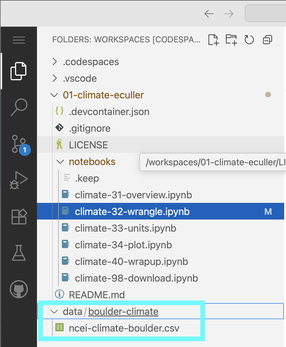
data folder mounted there.You can also take a look at your data using the bash programming language, either in your terminal or here in your Jupyter notebook (the ! indicates to use the current bash process, and the {} indicates to use a Python variable):
!ls "{project.project_dir}"ncei-climate-boulder.csvThe pandas library you imported can download data from the internet directly into a type of Python object called a DataFrame. In the code cell below, you can see an attempt to do just this. But there are some problems…
Make any changes needed to get this code to run. HINT: The filename.csv isn’t correct - you need to replace it with the name of the file you downloaded! See if you can find where the data downloaded to.
The pd.read_csv() function isn’t formatting the data 100% correctly. Modify the code to include the following additional parameters, making sure to put a comma (,) in-between each parameter:
index_col='DATE' – this sets the DATE column as the index. Needed for subsetting and resampling later onparse_dates=True – this lets python know that you are working with time-series data, and values in the indexed column are date time objectsna_values=['NaN'] – this lets python know how to handle missing valuesWe can’t get the data back later on because it isn’t saved in a variable. In other words, we need to give the url a name so that we can request in from Python later (sadly, Python has no ‘hey what was that thingy I typed yesterday?’ function). Make sure to use an expressive variable name so you remember what it is later on!
One of the most common challenges for new programmers is making sure that your results are stored so you can use them again. In Python, this is called naming, or saving a variable. Learn more in this hands-on activity on using variables from our learning portal.
# Load climate data from NCEI
pd.read_csv(
    project.project_dir / 'filename.csv'
)| STATION | TOBS | |
|---|---|---|
| DATE | ||
| 1893-10-01 | USC00050848 | NaN |
| 1893-10-02 | USC00050848 | NaN |
| 1893-10-03 | USC00050848 | NaN |
| 1893-10-04 | USC00050848 | NaN |
| 1893-10-05 | USC00050848 | NaN |
| ... | ... | ... |
| 2023-09-26 | USC00050848 | 74.0 |
| 2023-09-27 | USC00050848 | 69.0 |
| 2023-09-28 | USC00050848 | 73.0 |
| 2023-09-29 | USC00050848 | 66.0 |
| 2023-09-30 | USC00050848 | 78.0 |
45971 rows × 2 columns
Check out the type() function below - you can use it to check that your data is now in DataFrame type object.
# Check that data was imported into a pandas DataFrame
type(climate_df)DataFrameYou can use double brackets ([[ and ]]) to select only the columns that you want from your DataFrame:
some_column_name to the Temperature column name.climate_df = climate_df[[some_column_name]]
climate_df| TOBS | |
|---|---|
| DATE | |
| 1893-10-01 | NaN |
| 1893-10-02 | NaN |
| 1893-10-03 | NaN |
| 1893-10-04 | NaN |
| 1893-10-05 | NaN |
| ... | ... |
| 2023-09-26 | 74.0 |
| 2023-09-27 | 69.0 |
| 2023-09-28 | 73.0 |
| 2023-09-29 | 66.0 |
| 2023-09-30 | 78.0 |
45971 rows × 1 columns
It’s important to keep track of the units of all your data. You don’t want to be like the NASA team who crashed a probe into Mars because different teams used different units!
One way to keep track of your data’s units is to include the unit in data labels. In the case of a DataFrame, that usually means the column names.
A big part of writing expressive code is descriptive labels. Let’s rename the columns of your dataframe to include units. Complete the following steps:
dataframe with the name of your DataFrame, and dataframe_units with an expressive new name.'temperature-column-name' with the temperature column name in your data, and 'temp_unit' with a column name that includes the correct unit. For example, you could make a column called 'temperature_k' to note that your temperatures are in degrees Kelvin.dataframe_units = dataframe.rename(columns={
'temperature-column-name': 'temp_unit',
})
dataframe_units| temp_f | |
|---|---|
| DATE | |
| 1893-10-01 | NaN |
| 1893-10-02 | NaN |
| 1893-10-03 | NaN |
| 1893-10-04 | NaN |
| 1893-10-05 | NaN |
| ... | ... |
| 2023-09-26 | 74.0 |
| 2023-09-27 | 69.0 |
| 2023-09-28 | 73.0 |
| 2023-09-29 | 66.0 |
| 2023-09-30 | 78.0 |
45971 rows × 1 columns
In this case, we want to convert data from degrees Fahrenheit to degrees Celcius. The equation for converting Fahrenheit temperature to Celcius is:
\[T_C = (T_F - 32) * \frac{5}{9}\]
The code below attempts to convert the data to Celcius, using Python mathematical operators, like +, -, *, and /. Mathematical operators in Python work just like a calculator, and that includes using parentheses to designate the order of operations.
This code is not well documented and doesn’t follow PEP-8 guidelines, which has caused the author to miss an important error!
Complete the following steps:
dataframe with the name of your DataFrame.'old_temperature' with the column name you used; Replace 'new_temperature' with an expressive column name.dataframe_units['new_temperature'] = (dataframe_units['old_temperature']-32*5/9)
dataframe_units| temp_f | temp_c | |
|---|---|---|
| DATE | ||
| 1893-10-01 | NaN | NaN |
| 1893-10-02 | NaN | NaN |
| 1893-10-03 | NaN | NaN |
| 1893-10-04 | NaN | NaN |
| 1893-10-05 | NaN | NaN |
| ... | ... | ... |
| 2023-09-26 | 74.0 | 23.333333 |
| 2023-09-27 | 69.0 | 20.555556 |
| 2023-09-28 | 73.0 | 22.777778 |
| 2023-09-29 | 66.0 | 18.888889 |
| 2023-09-30 | 78.0 | 25.555556 |
45971 rows × 2 columns
Using the code below as a framework, write and apply a function that converts to Celcius. You should also rewrite this function name and parameter names to be more expressive.
# Convert units with a function
def convert(temperature):
    """Convert Fahrenheit temperature to Celcius"""
    return temperature # Put your equation in here

dataframe['TEMP_C'] = (
dataframe['TEMP_F'].apply(convert))Plotting in Python is easy, but not quite this easy:
climate_u_df.plot()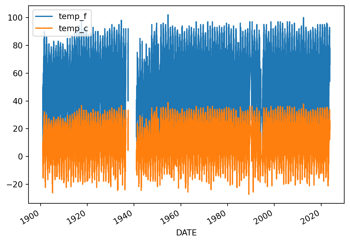
Looks like we have both temperature units on the same plot, and it’s hard to see what it is because it’s missing labels!
Make sure each plot has:
When plotting in Python, you’ll always need to add some instructions on labels and how you want your plot to look.
dataframe to your DataFrame name.y= to the name of your temperature column name.title, ylabel, and xlabel parameters to add key text to your plot.figsize=(x,y) where x is figure width and y is figure heightLabels have to be a type in Python called a string. You can make a string by putting quotes around your label, just like the column names in the sample code (eg y='temperature').
# Plot the data using .plot
climate_u_df.plot(
    y='the_temperature_column',
    title='Title Goes Here',
    xlabel='Horizontal Axis Label Goes Here',
    ylabel='Vertical Axis Label Goes Here')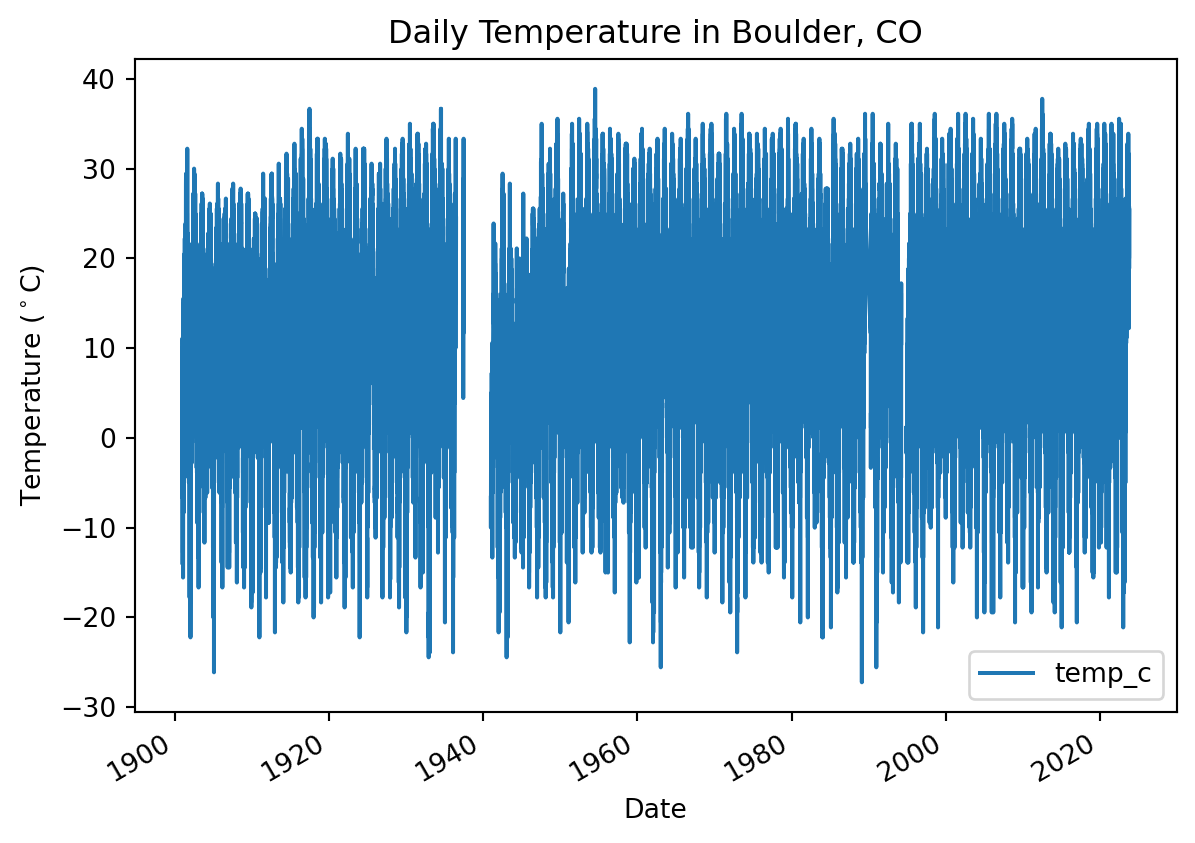
There are many other things you can do to customize your plot. Take a look at the pandas plotting galleries and the documentation of plot to see if there’s other changes you want to make to your plot. Some possibilities include:
Not sure how to do any of these? Try searching the internet, or asking an AI!
You may notice that your plot looks a little “fuzzy”. This happens when Python is trying to plot a value for every date, but the resolution of the image is too low to actually do that. You can address this issue by resampling the data, or summarizing it over a time period of your choice. In this case, we will resample annually, giving us one data point per year.
DT_OFFSETwith a Datetime Offset Code. Check out the table in the pandas datetime documentation to find the one you want (we recommend the start of the year).agg_method_here with a method that will calculate the average annual value. Check out the pandas resampling documentation for a list of common built-in options.ann_climate_df = (
climate_u_df
.resample('DT_OFFSET')
.agg_method_here()
)
ann_climate_df| temp_f | temp_c | |
|---|---|---|
| DATE | ||
| 1893-01-01 | NaN | NaN |
| 1894-01-01 | NaN | NaN |
| 1895-01-01 | NaN | NaN |
| 1896-01-01 | NaN | NaN |
| 1897-01-01 | NaN | NaN |
| ... | ... | ... |
| 2019-01-01 | 54.426997 | 12.459443 |
| 2020-01-01 | 57.691460 | 14.273033 |
| 2021-01-01 | 57.538462 | 14.188034 |
| 2022-01-01 | 56.139726 | 13.410959 |
| 2023-01-01 | 58.996337 | 14.997965 |
131 rows × 2 columns
Following the PEP-8 style guide is important because it makes your code easy for you and other collaborators to read. When you are splitting function calls across multiple lines, your code should look like this:
my_dataframe.plot(
    y='column_name',
    title=f'My Fantastic Plot',
    xlabel='The x Axis',
    ylabel='The y Axis'
)
or maybe this:
my_dataframe.plot(y='column_name',
                  title=f'My Fantastic Plot',
                  xlabel='The x Axis',
ylabel='The y Axis')Try to avoid these PEP-8 violations:
my_dataframe.plot(y='column_name', title=f'My Fantastic Plot', xlabel='The x Axis', ylabel='The y Axis')or
my_dataframe.plot(
    y='column_name',
      title=f'My Fantastic Plot',
   xlabel='The x Axis',
   ylabel='The y Axis'
)
or
my_dataframe.plot(y='column_name',
    title=f'My Fantastic Plot',
    xlabel='The x Axis',
    ylabel='The y Axis'
)
# Plot the annual data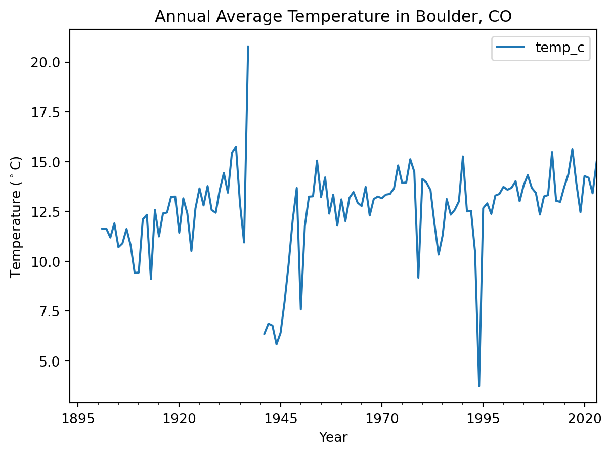
You can use the .hvplot() method with similar arguments to create an interactive plot.
.plot in your code with .hvplotNow, you should be able to hover over data points and see their values!
# Plot the annual data interactivelyYou will need to save your analyses and plots to tell others about what you find.
Just like with any other type of object in Python, if you want to reuse your work, you need to give it a name.
hvplot code, and give your plot a name by assigning it to a variable. HINT: if you still want your plot to display in your notebook, make sure to call its name at the end of the cell.my_plot with the name you gave to your plot.'my_plot.html' with the name you want for your plot. If you change the file extension, .html, to .png, you will get an image instead of an interactive webpage, provided you have the necessary libraries installed.Once you run the code, you should see your saved plot in your files – go ahead and open it up.
If you are working in GitHub Codespaces, right-click on your file and download it to view it after saving.
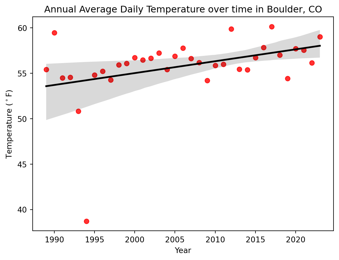
hv.save(my_plot, 'my_plot.html')Global climate change causes different effects in different places when we zoom in to a local area. However, you probably noticed when you looked at mean annual temperatures over time that they were rising. We can use a technique called Linear Ordinary Least Squares (OLS) Regression to determine how quickly temperatures are rising on average.
Before we get started, it’s important to consider that OLS regression is not always the right technique, because it makes some important assumptions about our data:
It’s pretty rare to encounter a perfect statistical model where all the assumptions are met, but you want to be on the lookout for serious discrepancies, especially when making predictions. For example, ignoring assumptions about Gaussian error arguably led to the 2008 financial crash.
Take a look at your data. In the cell below, write a few sentences about ways your data does and does not meet the linear OLS regression assumptions.
The following cell contains package imports that you will need to calculate and plot an OLS Linear trend line. Make sure to run the cell before moving on, and if you have any additional packages you would like to use, add them here later on.
# Advanced options on matplotlib/seaborn/pandas plots
import matplotlib.pyplot as plt
# Common statistical plots for tabular data
import seaborn as sns
# Fit an OLS linear regression
from sklearn.linear_model import LinearRegressionscikit-learn package to perform a OLS linear regression to the code cell below.We know that some computers, networks, and countries block LLM (large language model) sites, and that LLMs can sometimes perpetuate oppressive or offensive language and ideas. However, LLMs are increasingly standard tools for programming – according to GitHub many developers code 55% faster with LLM assistance. We also see in our classes that LLMs give students the ability to work on complex real-world problems earlier on. We feel it’s worth the trade-off, and at this point we would be doing you a disservice professionally to teach you to code without LLMs. If you can’t access them, don’t worry – we’ll present a variety of options for finding example code. For example, you can also search for an example on a site like StackOverflow (this is how we all learned to code, and with the right question it’s a fantastic resource for any coder to get access to up-to-date information from world experts quickly). You can also use our solutions as a starting point.
# Fit an OLS Linear Regression to the dataSlope: 0.13079071315632046 degrees per yearTrend lines are often used to help your audience understand and process a time-series plot. In this case, we’ve chosed mean temperature values rather than extremes, so we think OLS is an appropriate model to use to show a trend.
This is a tricky issue. When it comes to a trend line, choosing a model that is technically more appropriate may require much more complex code without resulting in a noticeably different trend line.
We think an OLS trend line is an ok visual tool to indicate the approximate direction and size of a trend. If you are showing standard error, making predictions or inferences based on your model, or calculating probabilities (p-values) based on your model, or making statements about the statistical significance of a trend, we’d suggest reconsidering your choice of model.
title, xlabel, and ylabel parameters. We’ve gotten you started with an example that shows how to put in the degree symbol. Make sure your labels match what you’re plotting!seaborn documentation for ideas.# Plot annual average temperature with a trend line
ax = sns.regplot(
x=,
y=,
)
# Set plot labels
ax.set(
title='',
xlabel='',
ylabel='Temperature ($^\circ$F)'
)
# Display the plot without extra text
plt.show()